Shopify Fly-Out and Slide-In Popups: Less Intrusive, More Effective

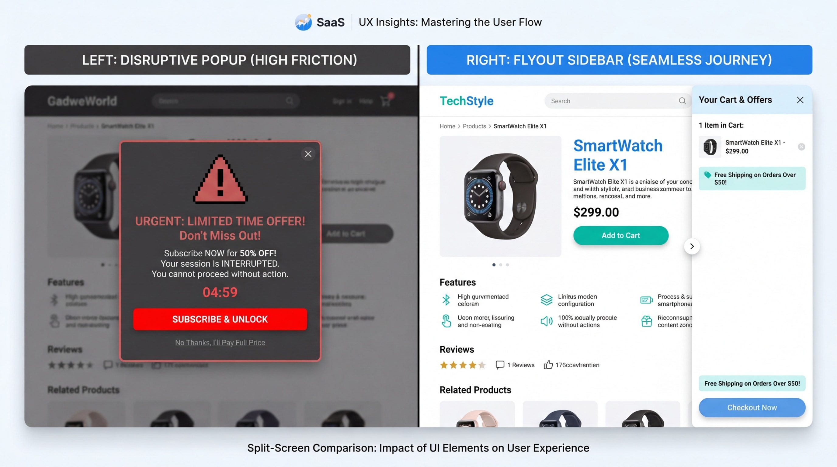
Let's be honest: traditional center popups often feel like digital roadblocks. You are browsing a product, and suddenly—bam!—your entire screen is blocked by a massive discount wheel. This interstitial anxiety does not just frustrate shoppers; it actively drives them away. This is especially true on mobile devices where closing a popup requires surgical precision.
That is exactly why top-performing eCommerce brands are ditching aggressive modals for the Shopify flyout popup sidebar. By sliding in from the edge of the screen, these non-intrusive alerts deliver promotions, cart updates, and upsells without hijacking the user's browsing experience. You can add a pop up on Shopify that actually helps your customers instead of annoying them.
In this guide, we will explore why sidebar flyouts are the ultimate conversion tool, how they preserve the mobile thumb zone, and the exact strategies you can use to seamlessly integrate them into your Shopify store. Whether you use a native theme like Dawn or a lightweight app, you can do this.
Let's get started!
I. Overview: The "Peripheral Persuasion" Framework
Flyouts preserve the visual anchor on your product page, reducing cognitive friction.
1. Flyouts vs. Center Modals
The concept of Peripheral Persuasion changes how you interact with visitors. By placing offers at the edge of the screen, you preserve the user's visual anchor on the product page. Traditional modals cause pogo-sticking, a scenario where users immediately hit the back button just to escape the interruption.
A subtle flyout reduces this cognitive load. It keeps your offer highly visible while allowing the shopper to stay completely in control of their browsing experience. The result? Lower bounce rates and happier customers.
2. The Mobile "Thumb Zone" Advantage
Mobile optimization is absolutely critical for your AOV (Average Order Value). According to UX research from the Baymard Institute, key interactions must happen within natural thumb reach. Bottom or side slide cart drawers align perfectly with this mobile thumb zone.
Standard popups rely on tiny, hard-to-click close buttons placed at the top corners of the screen. Mobile-first flyouts remove this physical friction entirely. When shoppers can easily navigate your offers with one hand, they buy more.
3. Fighting Banner Blindness
Shoppers have developed automatic defensive reflexes. When a center modal appears, they click close instantly without reading a single word. Animated slide-ins bypass this reflex entirely.
Because they slide in smoothly from the periphery, they catch the eye without triggering immediate annoyance. This context-aware messaging delivers a direct conversion lift. You get your message across, and the customer does not feel spammed.
II. 7 Strategies for High-Converting Shopify Flyout Popups
A flyout is only as good as its timing and design. If you want to maximize your Shopify home page pop up or product page alerts, follow these seven proven strategies.
1. Optimize Triggers for Intent, Not Just Time
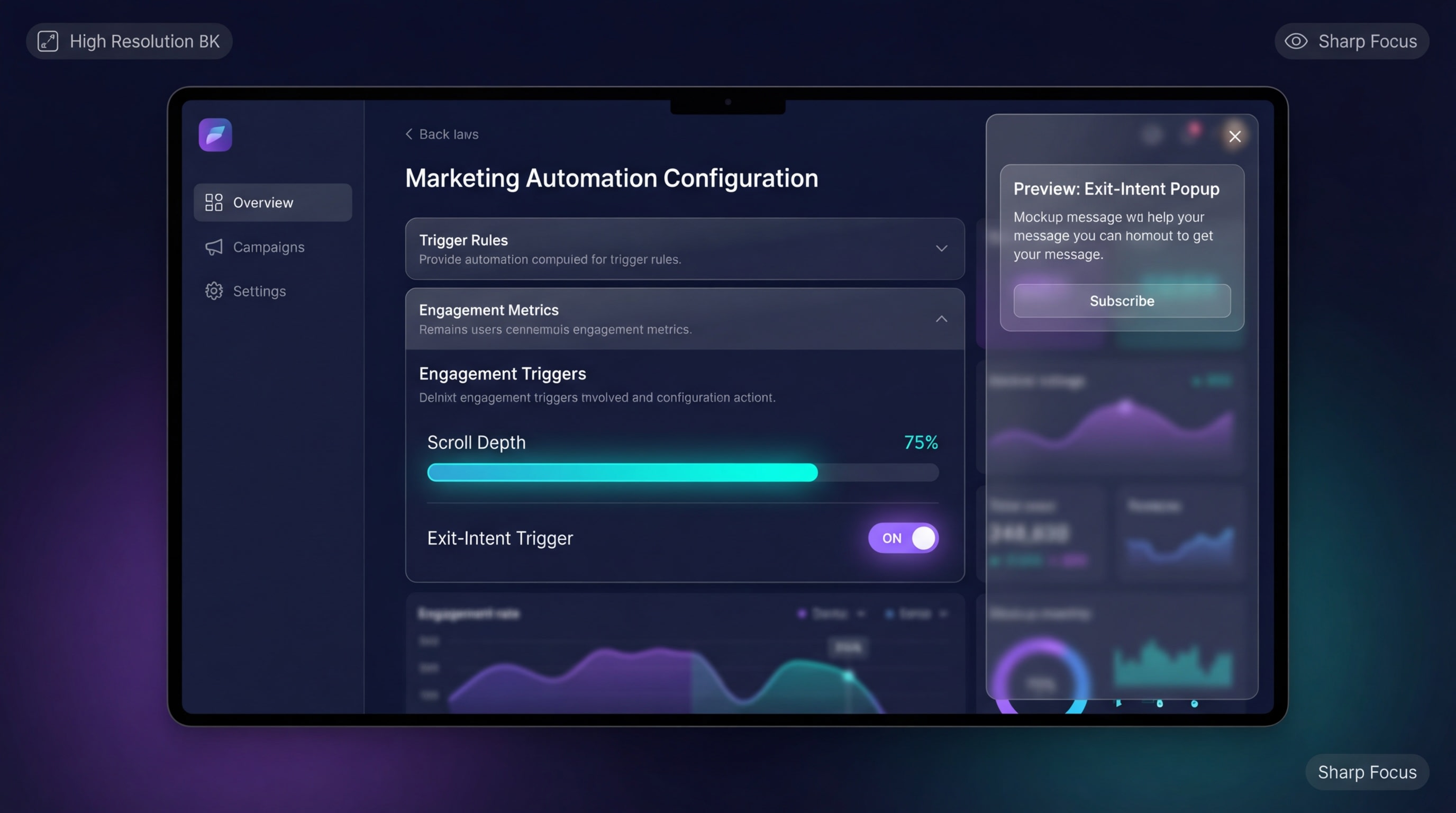
Time your flyouts to appear exactly when the shopper shows high intent.
Instead of blasting a flyout three seconds after a visitor lands, tie the popup to actual user behavior.
Why this matters: Trigger-based popups feel like helpful suggestions rather than annoying interruptions.
Here is how to implement intent triggers:
- Scroll-depth triggers: Show the sidebar only after a user scrolls past the product description. This action clearly indicates active reading interest and high purchase intent.
- Add-to-cart actions: Trigger a slide cart drawer immediately after a button click to confirm the action smoothly. This prevents confusion about whether the item was successfully added.
- Exit-intent on desktop: Slide in a promo code just as the mouse moves toward the browser tab. Give them a final reason to stay.
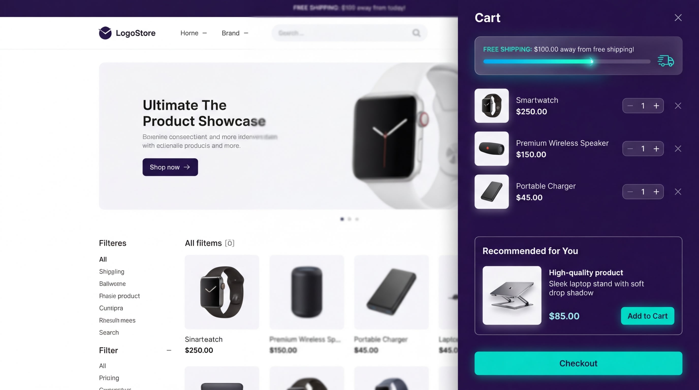
2. Implement the "Cart-Lock" Strategy
Using a slide cart drawer is one of the most effective ways to keep users locked into your checkout funnel.
Why this matters: It allows shoppers to review their cart without being redirected to a separate /cart page. They stay right on the product page where they can continue shopping and adding items.
Steps for frictionless implementation:
- Enable AJAX Add-to-Cart: Ensure your Shopify theme allows items to be added without a page refresh. This is foundational for modern eCommerce.
- Feature Stacking: Add a progress shipping bar directly inside the flyout. Text like "You are $15 away from free shipping" gamifies the shopping experience.
- Review Popup Rules: Ensure your cart drawer does not overlap with other alerts. You can master this balance by reading our comprehensive guide on Website Popup Design: What to Do and What to Avoid.
3. Match the Flyout to Your Shopify Theme (Dawn/Sense)
Nothing destroys trust faster than a popup that looks completely disconnected from your brand's aesthetic.
Why this matters: Third-party app default styles often clash heavily with modern Shopify 2.0 themes like Dawn or Sense. This visual mismatch makes your store look cheap and untrustworthy.
Here is how to seamlessly blend your design:
- Inherit Theme Fonts: Ensure your popup CSS uses
var(--font-body-family)to match your store fonts naturally. - Color Variables: Utilize Shopify's native color scheme variables for the popup background and primary buttons. Consistency is key.
- Border Radius: If your Dawn theme features sharp edges on product cards, remove the rounded corners from your flyout app to match.
Pro Tip: Keep the overlay background behind the flyout slightly transparent (e.g., rgba(0,0,0,0.4)) so the product page remains clearly visible underneath.4. Optimize Micro-Copy for Higher AOV
Smart micro-copy transforms a basic popup into a powerful revenue generator.
The text inside your sidebar should never just say "Subscribe." It needs to drive actionable value.
Why this matters: Space is limited in a sidebar. Every single word must pull its weight to encourage an upsell or push a conversion.
Write copy that converts:
- Clear Headlines: Swap "Join Our Newsletter" for an action-driven headline like "Unlock 15% Off Your Current Cart."
- Urgency Elements: Add subtle, reassuring text like "Promo code auto-applies at checkout." This removes the friction of copy-pasting codes.
- In-Cart Upsells: Use actionable prompts directly beneath the cart items. A phrase like "Pairs perfectly with…" drives immediate cross-sells.
5. Prioritize Accessibility (WCAG Compliance)
An often-overlooked aspect of sidebar popups is how screen readers and keyboard users interact with them.
Why this matters: Inaccessible popups can physically trap keyboard users on your site. This ruins their experience and potentially causes legal compliance issues for your business.
Make your flyouts accessible:
- Focus Trapping: Ensure that when the flyout opens, the keyboard focus moves into the sidebar and stays there until intentionally closed.
- Clear Close States: The "X" button must have a clear
aria-label="Close dialog"attribute in the HTML. - Escape Key Output: Configure the flyout to close instantly when the user presses the ESC key on their keyboard.
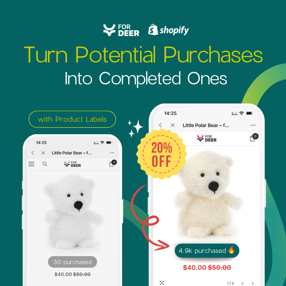
6. Use Contextual Product Page Promos
Do not show the exact same generic flyout on every single page of your Shopify store.
Why this matters: Relevancy drives conversion. A highly targeted message performs drastically better than a site-wide banner.
Deploy contextual offers:
- Collection-Specific Offers: If a user is browsing the "Winter Jackets" collection, slide in a flyout offering a discount specifically for winter gear.
- Size Guide Flyouts: Instead of directing users to a completely new page, use a sidebar flyout to display complex sizing charts directly on the product page.
- Stock Alerts: Trigger a low-stock warning flyout when a visitor lingers on a specific product page for more than 45 seconds.
7. Monitor Mobile-Specific Performance
What looks absolutely perfect on a 27-inch desktop monitor might be entirely broken on an iPhone screen.
Why this matters: Over 60% of Shopify traffic is mobile. If your sidebar covers the entire mobile screen, it is no longer a flyout. It is just a modal in disguise.
Optimize for the small screen:
- Width Restrictions: Ensure your mobile flyout only takes up 80-90% of the screen width. Leave a visible sliver of the main site so the user knows they have not left the page.
- Disable Heavy Animations: Keep the slide-in animation under 0.3 seconds on mobile devices. Anything longer feels sluggish and broken.
- Thumb-Friendly Buttons: Ensure all Call-To-Action buttons inside the flyout are at least 44x44 pixels to prevent frustrating misclicks.
III. Technical Setup: Performance & Implementation
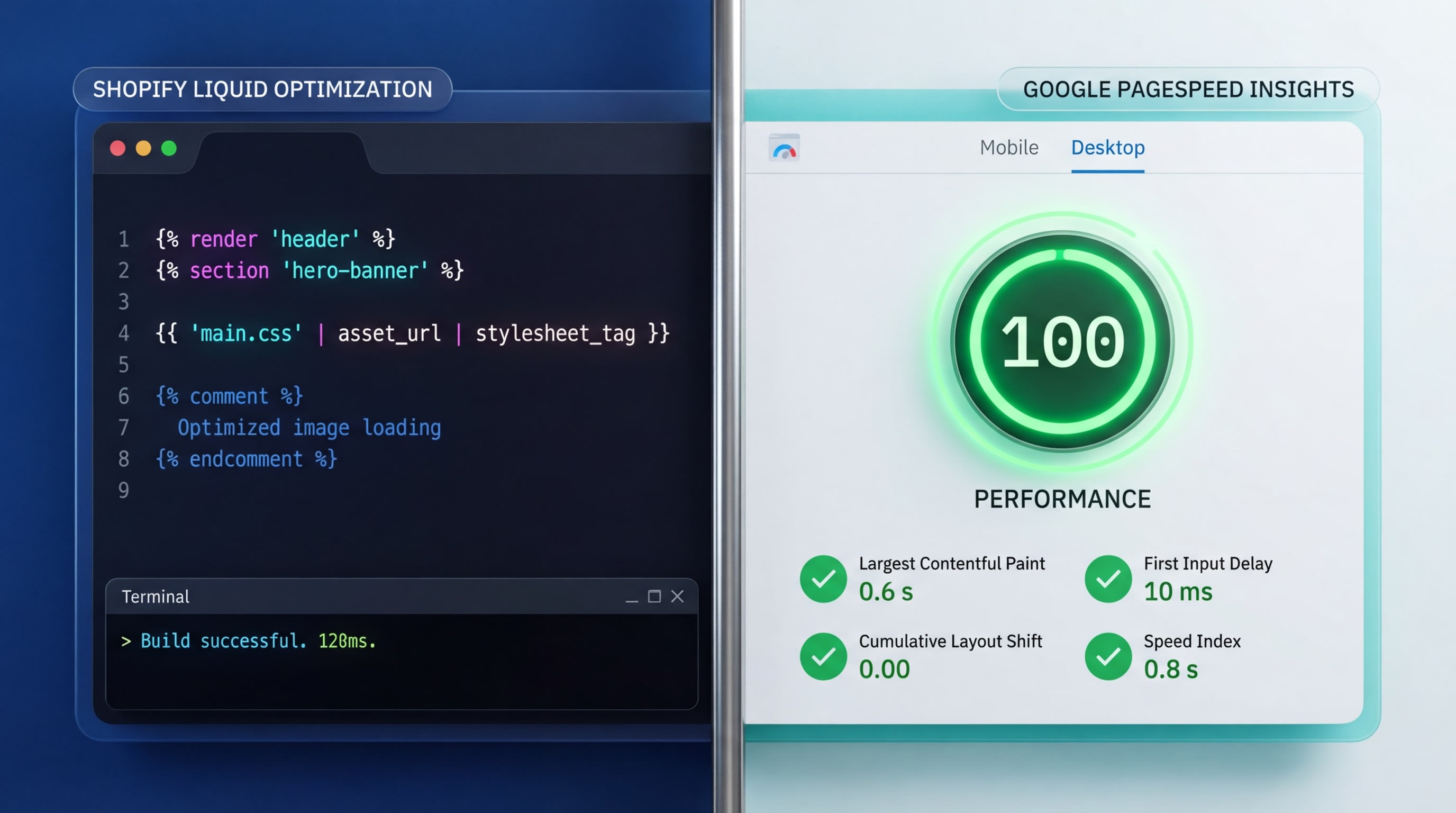
Heavy JS apps can tank your speed. Consider lightweight CSS or native theme options.
How you build or install your flyout is just as important as how it looks. A beautiful popup is useless if it crashes your website speed.
1. The Speed Impact: CSS vs. Heavy JS Apps
Heavy popup scripts frequently cause slow site speed. Core Web Vitals like Largest Contentful Paint (LCP) and Cumulative Layout Shift (CLS) suffer massively when poorly coded popup apps load too early. For an in-depth look at mastering these design details while preserving your load times, read our post on Enhancing User Experience: Shopify Popup Design Tips and Tricks.
The solution is straightforward. Advocate for lightweight apps or CSS-only animations using @keyframes. Deferring your popup JavaScript until after the main page load is critical for maintaining peak Shopify performance.
2. DIY Shopify Liquid Implementation Basics
Intermediate users and developers often want to build their own lightweight solutions to bypass heavy apps completely. While DIY is great for speed, maintaining it requires solid developer knowledge.
Here is the basic implementation structure:
- Create a Snippet: Start by creating a new
flyout-sidebar.liquidfile within your theme code. - Use the Section Rendering API: This powerful Shopify API allows you to update cart contents dynamically without forcing a full page refresh.
- Apply CSS Transitions: Use simple CSS like
transform: translateX(100%)transitioning to0to create a buttery-smooth slide-in effect.
3. A/B Testing Your Sidebar
You need hard data to measure if the flyout is actually working better than your old modal. Do not rely on guessing.
Key metrics to track during testing:
- Bounce rate reduction
- Overall AOV lift
- Popup engagement and click-through rate
Test your timing triggers before you test your design. A five-second delay will perform completely differently than a scroll-depth trigger. If you are not a developer, use a reliable Shopify app with built-in analytics to run these split tests automatically.
IV. Conclusion
Upgrading to a Shopify flyout popup sidebar is one of the smartest UX decisions you can make for your store. By moving away from disruptive center modals, you preserve the shopper's visual anchor, improve mobile accessibility, and keep users engaged exactly where you want them: on your product pages and in the checkout funnel.
Implementation does not have to be a headache. Whether you choose to custom-code a lightweight Liquid solution or install an optimized, speed-friendly app, the key is to prioritize non-intrusive timing and relevant micro-copy. Start small, test your triggers, and watch your Average Order Value climb.
Follow the Fordeer Team for more useful updates!
- Install Fordeer Apps for Free
- Get immediate assistance by chatting with us
- Join Fordeer Commerce Community for fresh app updates, expert tips, and private deals.