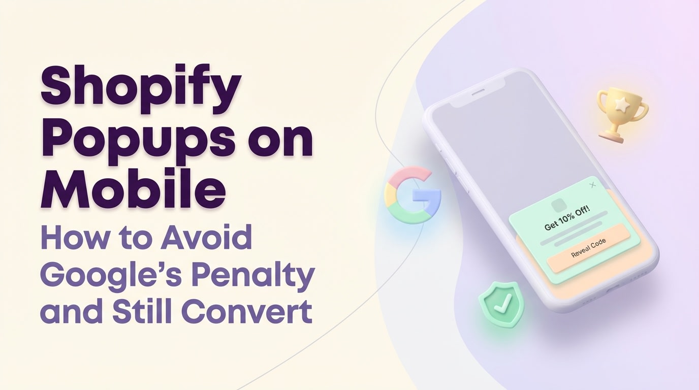
Shopify Popups on Mobile: How to Avoid Google's Penalty and Still Convert

Mobile traffic drives the majority of eCommerce sales. Yet, most merchants accidentally kill their mobile conversion rates with clunky, screen-blocking banners. Worse, if your mobile popup blocks the main content the second a shopper lands from search results, you are actively putting your store at risk of being penalized by Google.
Designing a high-converting shopify popup for mobile users requires a delicate balance between Conversion Rate Optimization (CRO) and strict SEO compliance. You need a solution that captures attention without triggering Google's intrusive interstitial penalty or frustrating shoppers on smaller screens.
In this guide, we break down the hidden SEO risks of mobile popups. We also introduce the incredibly safe two-step strategy and share seven actionable tips to help you capture more mobile leads while keeping your store running fast and ranking high.
Let's get started.
I. Overview of Mobile Popup Risks and Rules
Understanding the difference between an SEO-safe mobile popup and an intrusive interstitial.
Before you build your campaign, you need to understand the technical constraints of mobile devices. Ignoring these rules will directly harm your store's visibility and user experience.
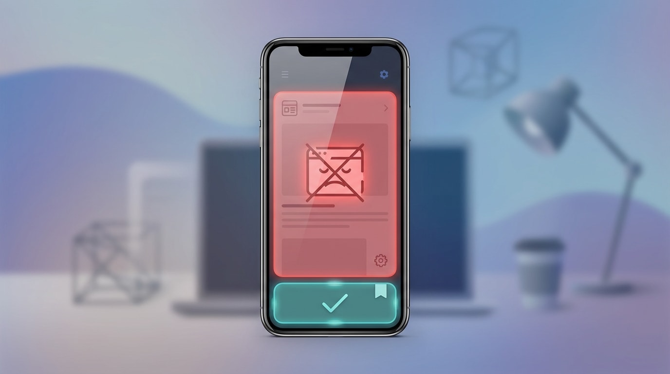
1. The Google Intrusive Interstitial Penalty
In 2017, Google rolled out a major Mobile-Friendly update. They began penalizing pages where content is not easily accessible to a user on the transition from the mobile search results.
If your popup covers the main content immediately upon landing, Google flags it as an "intrusive interstitial." The impact is severe. You will lose mobile search rankings because your content forces users to clear an obstacle before reading.
2. The Impact on Core Web Vitals
Heavy popup scripts directly affect your Shopify theme load times. When popup apps load late and push your page content down, they trigger a Cumulative Layout Shift (CLS) error.
Keeping your popup code lightweight matters just as much as the actual design. According to recent data, eCommerce sites with a 1-2 second loading time convert at a much higher rate. Every extra second of delay costs you sales.
3. The "Thumb Zone" Reality
The "thumb zone" is the lower half of a mobile screen where users can naturally reach with one hand. This is the most ignored CRO metric on Shopify.
Placing your call-to-action buttons and close icons outside this zone increases bounce rates. When shoppers have to stretch their thumbs or use two hands just to dismiss a popup, user frustration spikes. You lose the lead and the sale.
II. 7 Strategies to Optimize a Shopify Popup for Mobile Users
Standard desktop popup tactics fail completely on mobile. You must balance aggressive marketing with a seamless user experience. Here are seven mobile-first strategies to build the perfect campaign.
1. Implement the "Two-Step" Strategy for 100% SEO Safety
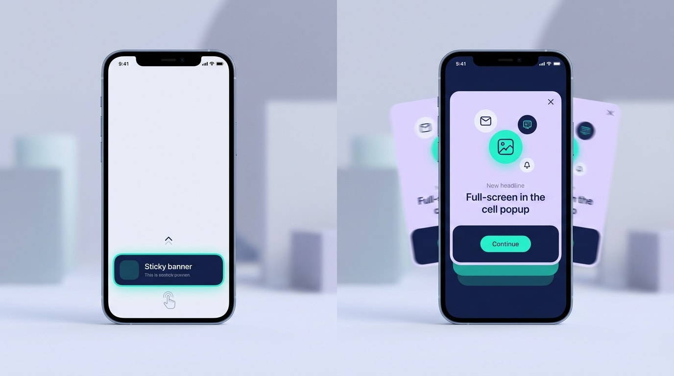
The Two-Step strategy ensures you never block a user's initial view of your store.
The two-step mobile popup strategy is the only way to balance high conversion with absolute SEO safety. Instead of a popup firing automatically, users see a small, non-intrusive floating bar. They must actively tap it to trigger the full form.
Here is how to implement it:
- Use a Teaser: Place a small "Unlock 15% Off" tab at the bottom of the screen.
- Trigger on Click: Set the main form to only open when that specific tab is interacted with.
- Stay Compliant: Because the user requested the popup, Google will never penalize you for blocking the screen.
This completely eliminates the mobile popup seo penalty risk.
2. Design Strictly for the "Thumb Zone"
A thumb friendly popup design prevents immediate abandonment. Make it effortless for users to interact with your offer.
Focus on these elements:
- Bottom Placement: Anchor your mobile popups to the bottom of the screen rather than floating them in the dead center.
- Accessible CTAs: Ensure the submit button is easily reachable by a right-handed user's thumb without stretching.
- Easy Dismissal: Place the close button in the bottom-left or top-right of the lower modal. Ensure it has a large enough tap target (at least 44x44 pixels) to prevent accidental clicks on the background.
3. Size Appropriately (The 20-30% Rule)
Physical screen real estate on mobile is incredibly limited. Google explicitly states that banners using a reasonable amount of screen space are perfectly safe. Learning the foundations of Website Popup Design: What to Do and What to Avoid will help you scale elements correctly.
Here is how to size your popup:
- Limit Height: Ensure your popup takes up no more than 30% of the vertical mobile screen.
- Remove Images: Hide bulky lifestyle images on mobile breakpoints. Rely on strong typography and color instead.
- Reduce Fields: Only ask for an email address. If you need SMS, use a multi-step form rather than cramming two fields into a tiny mobile view.
Pro Tip: Test your popup on an older, smaller mobile device, not just the newest oversized models, to ensure it remains compliant across all screens.
4. Delay the Trigger Wisely (Mobile Exit-Intent)
Exit-intent works differently on mobile since there is no mouse cursor to track. Firing a popup within three seconds of a mobile visit guarantees a high bounce rate.
Use these advanced triggers instead:
- Scroll Depth: Trigger the popup only after the user has scrolled past 50% of your product page.
- Upward Scroll: Use scroll up triggers. These mimic exit-intent on mobile devices when users scroll back up to find the navigation menu.
- Time on Page: Set a minimum 15-second delay to ensure the user is actually engaged before interrupting them.
5. Ditch the "Fake Sales" Tactics
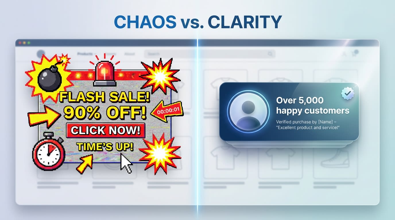
Authentic social proof builds trust far better than artificial urgency.
Mobile users are highly skeptical of intrusive marketing. The fake sales pop up shopify trend destroys brand trust. Spammy notifications that fire every three seconds clutter the screen and feel cheap.
Here is how to build real trust:
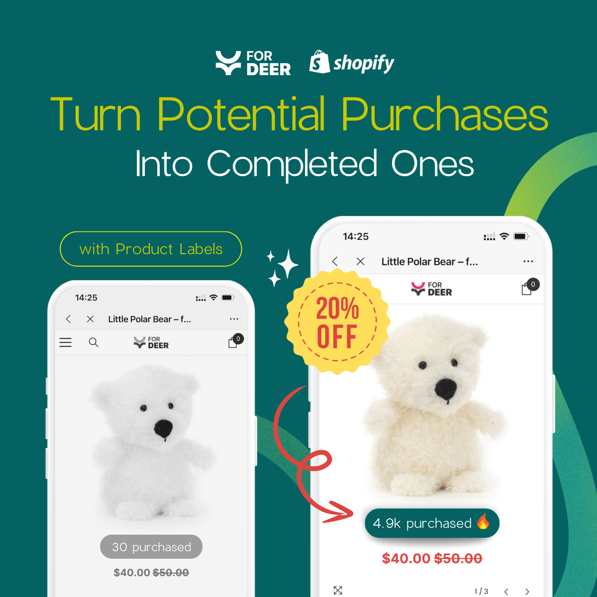
- Use Real Data: If you use recent sales popups, ensure they pull genuine order data from your Shopify dashboard.
- Cap Frequency: Limit notifications to show a maximum of two times per session.
- Focus on Value: Replace fake urgency with a high-value discount code in exchange for their email address.
6. Use SVG Instead of PNG for Faster Loading
Heavy graphics destroy mobile performance. This is a massive technical gap many merchants overlook.
- The Problem: Heavy PNG or JPEG graphics in a popup can stall the entire page render on a basic 3G or 4G mobile network.
- The Solution: Use Scalable Vector Graphics (SVG) for any icons, logos, or decorative elements inside your mobile popup.
- The Benefit: SVGs scale infinitely without losing quality on high-retina mobile screens. They usually weigh less than 5KB, protecting your Core Web Vitals.
7. Leverage Shopify Theme App Embeds
Old popup apps injected heavy custom code directly into your theme files, causing massive mobile slowdowns. You must protect your store's architecture.
Modernize your integration:
- Modern App Blocks: Only use popup apps that utilize Shopify's Theme App Embed architecture.
- Clean Uninstalls: This ensures that if you disable the popup, zero leftover code remains to bog down your mobile site.
- Native Targeting: Theme App blocks allow you to easily toggle the popup's visibility between mobile and desktop right from the Shopify Theme Editor.
III. Choosing the Right App for Your Store
With over 379 popup apps currently available on the Shopify App Store, choosing the right tech stack for mobile optimization can feel overwhelming. Here is what to consider when evaluating your options.
1. Finding a Free Shopify Popup for Mobile Users
Many merchants search for budget-friendly solutions to start collecting leads. Native Shopify Forms offer a good starting point but feature severe limitations regarding mobile layout control and advanced targeting.
To maximize conversions without expanding your budget, look for third-party apps offering robust free tiers. For instance, you can focus on Enhancing User Experience: Shopify Popup Design Tips and Tricks by utilizing apps like Fordeer Sales Pop Up. These tools include advanced mobile-specific display rules without requiring immediate upgrades.
2. Desktop vs. Mobile Separation Features
The ability to create completely separate campaigns for mobile and desktop is a non-negotiable feature. A responsive popup is simply not enough.
You need an app that allows you to change the actual trigger rules based on the device. For example, you should be able to run an exit-intent trigger for desktop users while simultaneously running a 50% scroll trigger for mobile visitors.
3. Integrated Marketing Automation
What happens after the mobile user submits their email? A smooth post-submission flow is critical for immediate sales.
Your app should instantly deliver the discount code directly on the mobile screen. The user should never have to leave your store, open their email app, and risk getting distracted. Look for seamless integrations with your wider email and SMS marketing flows to automatically sync leads to your welcome series.
IV. Conclusion
Building an effective shopify popup for mobile users requires more than just scaling down your desktop design. By understanding Google's strict interstitial rules, respecting the physical constraints of the thumb zone, and utilizing the incredibly safe two-step strategy, you can aggressively grow your email list without sacrificing search rankings.
Your mobile traffic is your most valuable asset. Do not let a poorly optimized popup drive potential customers away. Take the time to implement these mobile-first strategies today, and watch your conversion rates soar.
Follow the Fordeer Team for more useful updates!
- Install Fordeer Apps for Free
- Get immediate assistance by chatting with us
- Join Fordeer Commerce Community for fresh app updates, expert tips, and private deals.