Website Popup Design: What to Do and What to Avoid

Designing pop-ups is akin to navigating a tightrope. Going too far in one direction can lead to penalties from Google and alienate users with intrusive, aggressive pop-ups. Conversely, playing it overly safe and formal may bore new visitors, causing them to leave without exploring your offerings.
In this guide, Fordeer delves into What to Do and What to Avoid for pop-up design, exploring the delicate balance between persuasion and user-friendly experiences. We'll present captivating pop-up design examples and dissect their standout qualities. Additionally, we'll examine common pop-up design mistakes and provide actionable solutions for avoidance and rectification.
Best Practices for Designing Website Pop-ups
First, let's explore the best practices for pop-up design. Given the limited screen real estate pop-ups occupy, maximizing their effectiveness is crucial by carefully crafting visuals and copy.
Maintain consistency
While pop-ups may appear as separate messages, they should seamlessly blend into your overall design, ensuring visitors can quickly identify them as personalized offers from your brand.
Elevate your headline
Your headline should take the spotlight, capturing the user's attention and drawing them in. It can adopt a cheeky, thought-provoking, conversational, or humorous tone, but be cautious not to veer into clickbait territory.
Master crafting engaging headlines for your landing pages to captivate your target audience. To maintain brand consistency, ensure your tone of voice aligns with your other communication channels, whether it's social media posts, blog articles, or, in this case, pop-ups.

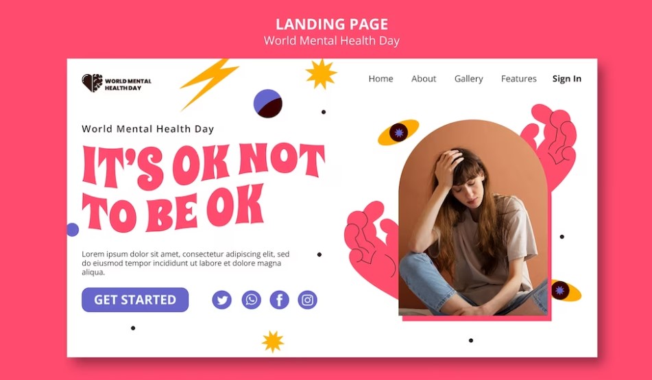
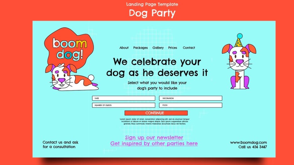
Here's an excellent illustration of a clean and highly impactful pop-up that exudes its unique character. The attention-grabbing headline offers just enough to pique the user's curiosity, compelling them to read. The pop-up's content fills in the details, all in a warm and friendly tone. This approach is ideal for fostering enduring customer relationships and revealing the human aspect of your brand.
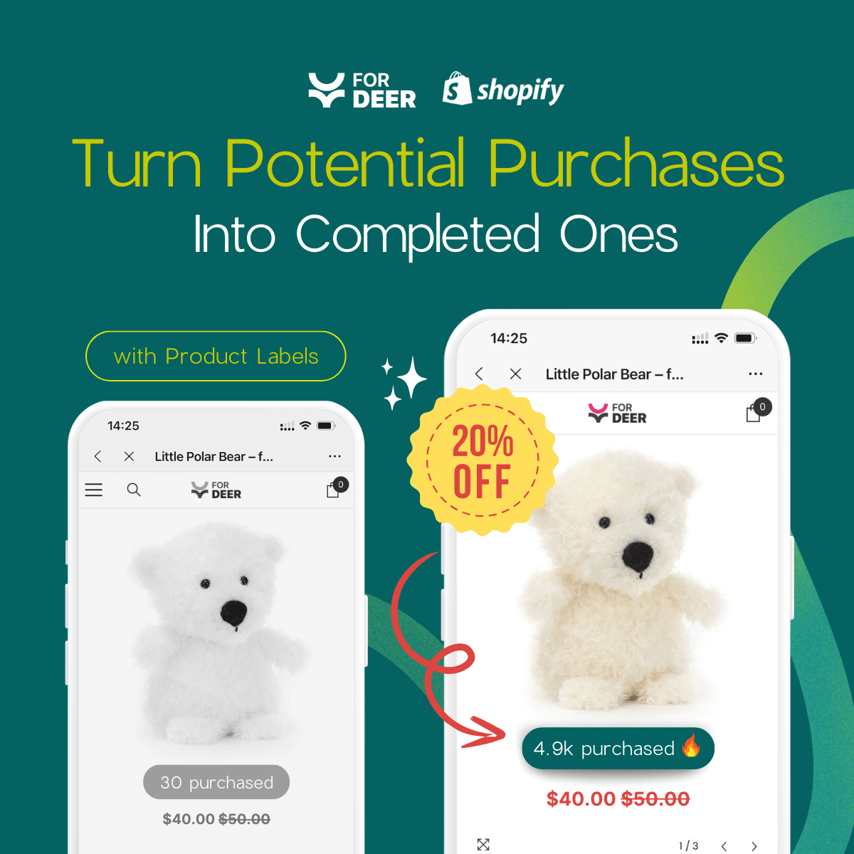
Incorporate time-sensitive or scarcity elements into your pop-up strategy
Enhance the effectiveness of your pop-ups by introducing an element of time sensitivity or scarcity. You can encourage customers to take action by highlighting time-sensitive offers like seasonal sales, limited edition products, or short-term discounts. It's crucial, however, to maintain honesty in your approach and provide appealing yet genuine limited-time offers to build and retain your audience's trust.
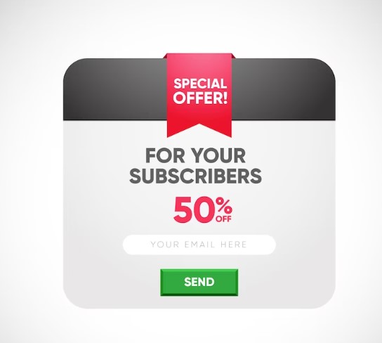
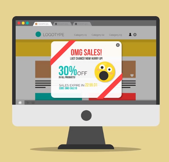
This pop-up captures the reader's attention and communicates the offer's essence. However, it could be enhanced by emphasizing the time limit more visually. This can be achieved using a contrasting color or a more prominent typeface to ensure potential customers get the offer before it expires.
Opt for custom illustrations over stock images
No matter how well-crafted your pop-up copy is, using a generic or clichéd image from a free photo library can diminish your chances of capturing your users' attention or piquing their interest. These same royalty-free stock images are employed by countless businesses worldwide, making it advisable to steer clear of them whenever you can. Instead, seek distinctive photos that align with your brand and its visual style.
Rather than employing posed, artificial images of people grinning, consider utilizing hand-drawn or creatively stylized visuals to give your pop-up a unique and distinctive appearance.
Offer your users a decision
To prevent frustration and ensure first-time visitors can easily dismiss your pop-up and access your main page, provide them with a choice. Sometimes, locating the close button can be challenging, so offering an alternative like a 'No, thanks' or 'Maybe later' button can be helpful.
By allowing your users to bypass content they deem irrelevant, you demonstrate your concern for their experience and your desire for them to enjoy a seamless, positive shopping experience. Similarly, you can incorporate a link to your privacy policy within your pop-up subscription form to maintain transparency and honesty with your audience.
Opt for a different approach
Opt for a different approach by incorporating authentic photographs instead of custom illustrations. Ensure these photos are candid and natural, allowing your audience to glimpse your personality or your team's character. This approach will set your pop-up messages apart and evoke an emotional response in your intended audience.
Crafting compelling copy will only demand a little effort when you have a captivating image at your disposal. An appealing and genuine photo can effortlessly convey your brand's essence and the people behind it, significantly reducing the verbal communication required to engage your visitors.
Don't approach pop-ups too gravely
They can be casual, formal, and filled with extensive text. Instead, they can serve as delightful surprises or Easter eggs for your users, injecting humour and a touch of playfulness into your subscription forms. Consider using puns, memes, GIFs, or emojis to add some flair and bring a smile to your visitors' faces, as illustrated in this example.
Even if your primary brand tone is typically formal, smaller formats like pop-ups allow room for experimentation and gauging your customers' responses to a more relaxed brand persona. It can also make seemingly mundane tasks like form-filling more engaging and enjoyable for them.
Bring values
Before requesting personal information from your website visitors, provide a compelling justification for why they should do so. To avoid your pop-up appearing spammy, ensuring it offers genuine value is crucial. How will your customers gain from completing your form? What can they anticipate after sharing their email address or phone number? What's the incentive for exploring your special offer?
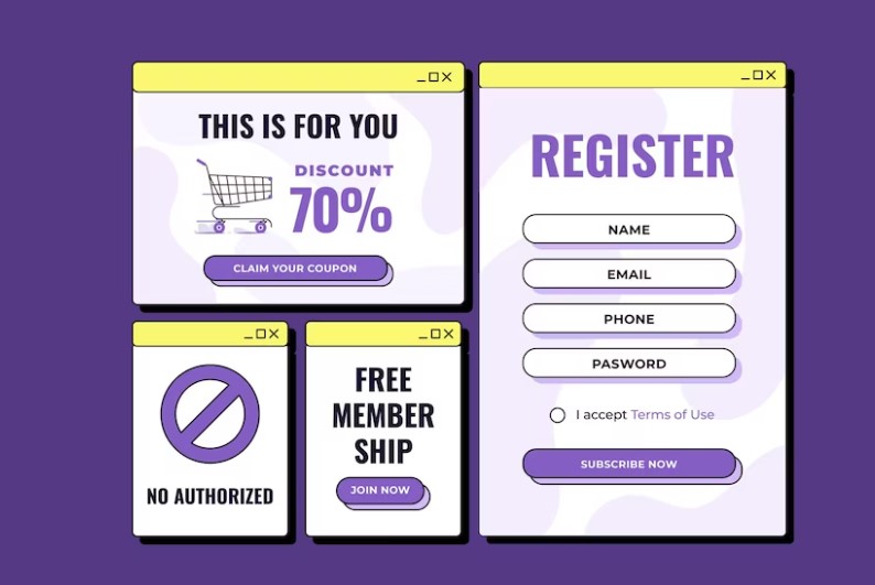
Highlight your expertise and reassure first-time visitors that they're in capable hands. Craft your pop-ups to emphasize your unique selling proposition. This example showcases clever, attention-grabbing headlines and prominent CTA buttons to achieve that.
For this reason, utilizing footer links is considered one of the best practices in pop-up design. By disclosing your privacy policy, you can enhance your conversion rate as visitors will have peace of mind, knowing their data won't be sold or misused.
Honour the user's screen real estate
Feel free to unleash your creativity when designing pop-ups, but always prioritize the user experience. Ensure that your use of space is justified and manageable for the entire screen, especially when your offer is modest. If you want your message to be attention-grabbing, consider using vibrant colours or unique shapes.
Take a look at this pop-up design example. Despite its small size, the message is easily noticeable due to its cheerful yellow background, which seamlessly integrates with the website's colour scheme. This exact shade of yellow is used consistently to emphasize text on the page.
Common mistakes in website pop-up design should avoid
Let's explore some pop-up designs that illustrate what should be avoided or approached differently. While it's essential to keep pop-up messages manageable, ensuring they remain meaningful and informative is equally important.
Pop-ups without a purpose
Avoid creating pop-ups without a purpose. While adding a pop-up for visual appeal may seem enticing, it's crucial to consider the user's experience. Ask yourself if the pop-up serves a specific function and contributes to the visitor's journey. If it only annoys or confuses them without providing value, it's better to avoid it. Pointless pop-ups need clear calls to action, making them too vague or explicit, as seen in this instance.
Users often need clarification and clarification about how to respond when encountering pop-ups with no explicit action. They may be interested in potential offers but are reluctant to invest time deciphering vague notifications. To ensure a smooth customer journey, avoiding uninformative pop-ups is advisable.
Resist the urge to oversimplify your pop-up
Excessively simplified pop-up designs, in their pursuit of clarity, can sometimes come across as unfinished or needing more professionalism, as demonstrated in this example.
Ensure that the critical elements of your pop-up design, such as the CTA button, headline, and supporting text, are appropriately placed to craft an engaging message.
Avoid pressuring others to share their data
Avoid compelling your website visitors to provide their information through intrusive or obligatory pop-up forms. Such practices can lead to customer dissatisfaction and may need to be better received by search engines like Google.
Instead of coercing users into making a purchase or subscribing, provide them with valuable content or exclusive deals that set your website pop-up apart. Ensure you aim for your pop-up to be a lead magnet rather than a deterrent.
Avoid using full-page pop-ups
Refrain from utilizing full-page pop-ups unless you have a valid reason. Full-screen pop-ups can disorient your website visitors and may lead them to believe they've arrived on the wrong page. The 'Close' button is often positioned farther away and harder to find due to the format, potentially causing confusion among users. In most cases, you can streamline your pop-up design and avoid dominating the entire screen.
Nevertheless, opting for a page overlay format can be justified when you have something crucial to showcase, such as a content-rich newsletter.

In this instance, the page overlay format gives users a preview of the offer, allowing them to assess its value before committing to it. This transparency alleviates concerns about sharing their email address. Another option is to employ a video pop-up, but it's important to note that creating a high-quality video requires significantly more effort.
Craft stunning website pop-ups effortlessly
With Fordeer: Sales Pop Up ‑ Popups, designing and implementing personalized pop-ups takes under 10 minutes. Select from our pre-designed templates and tailor them to your preferences using our intuitive drag-and-drop builder. Then, establish display conditions to ensure your message appears at precisely the right moment.
Our platform empowers you to create responsive, GDPR-compliant pop-up forms to supercharge your conversion rates, transforming passive visitors into devoted customers. Bid farewell to clunky, ill-placed pop-ups—our solution enables you to deploy various scenarios and CTAs tailored to your page's objectives, ensuring users encounter the most pertinent messages.

Fordeer: Sales Pop-Up ‑ Popups equip you with a comprehensive marketing and sales automation toolkit. Capture leads via pop-ups and chatbots and nurture them through email campaigns. Give it a whirl!
Conclusion
In conclusion, website popup design is a delicate art that can significantly influence user engagement and conversion rates. By adhering to best practices and avoiding common pitfalls, you can create popups that enhance the user experience and effectively convey your message.
The key to successful popup design is distinguishing between capturing attention and providing a seamless browsing experience. These guidelines will help you create popups that are more likely to be well-received by your audience and contribute positively to your website's objectives.