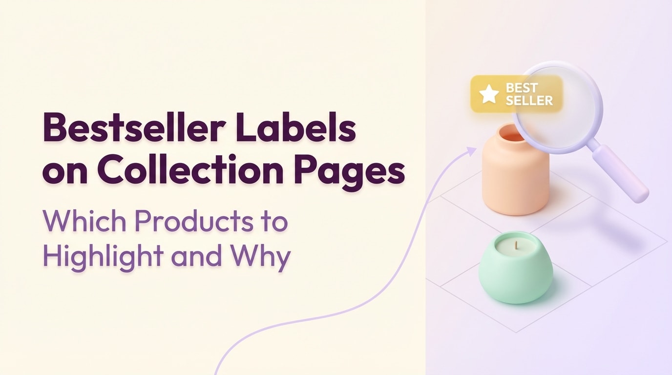
Bestseller Labels on Collection Pages: Which Products to Highlight and Why

Visitors are landing on your collection pages, scrolling through dozens of products, and leaving without clicking a single item. This phenomenon is called decision fatigue. When shoppers are presented with too many equal choices, they often choose nothing at all.
This is where strategic merchandising comes into play. By implementing a best seller label shopify collections setup, you instantly guide your customers' eyes to proven winners. It takes the guesswork out of shopping and leverages social proof to validate their purchasing decisions.
In this guide, we will break down exactly why these small visual cues work so well. You will learn seven actionable strategies to deploy best seller badges effectively, plus the common merchandising mistakes that could be hurting your store's credibility.
Let's get started!
I. The Psychology Behind Best Seller Labels
Highlighting top products reduces cognitive load for your shoppers
1. The Power of Social Proof
Humans are wired for herd mentality. When we see others validating a choice, we feel confident making that same choice ourselves. In eCommerce, buyers instinctively trust the purchasing decisions of fellow shoppers over marketing copy. A simple badge instantly communicates popularity without forcing your visitors to click through and read dozens of reviews. It acts as an immediate stamp of approval.
2. Reducing Decision Fatigue
Large catalog grids often cause choice paralysis. When faced with rows of similar items, shoppers burn mental energy trying to differentiate them. Badges solve this by creating a clear visual hierarchy. They point a giant arrow at the safest choice for hesitant buyers. Instead of comparing twenty products, the customer only needs to evaluate the top three.
3. The Halo Effect on Your Brand
Highlighting your most popular items elevates the perceived value of your entire catalog. When new visitors see items tagged as fast-moving favorites, it establishes instant brand authority. They assume your store is busy, trusted, and in demand. This strategy leads directly to faster inventory turnover and significantly higher click-through rates across your collection pages.
II. 7 Strategies to Maximize Collection Page Badges
Implementing badges requires more than just picking a bright design. To truly move the needle on your conversion rates, you need a deliberate approach to how and where these labels appear on your grid.
1. Automate Badges Based on Real Sales Data
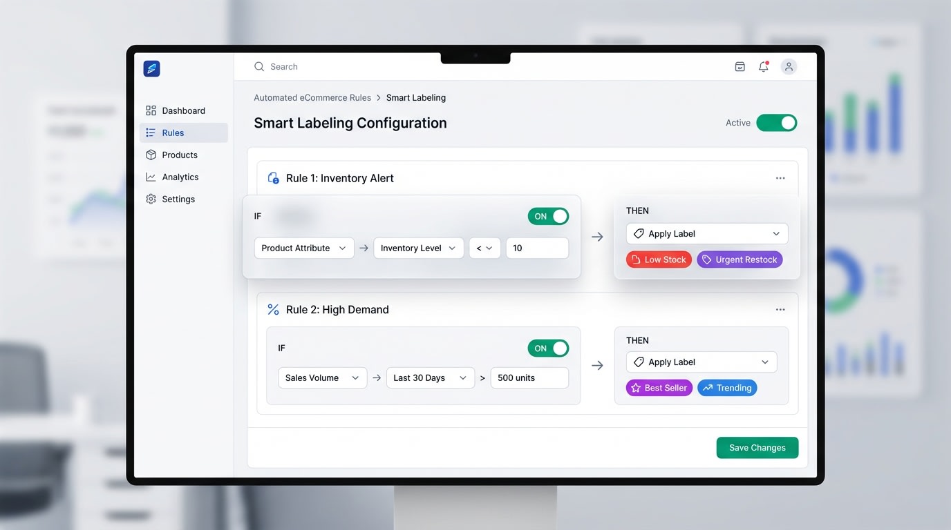
Automated label rules ensure your collection pages always display accurate data
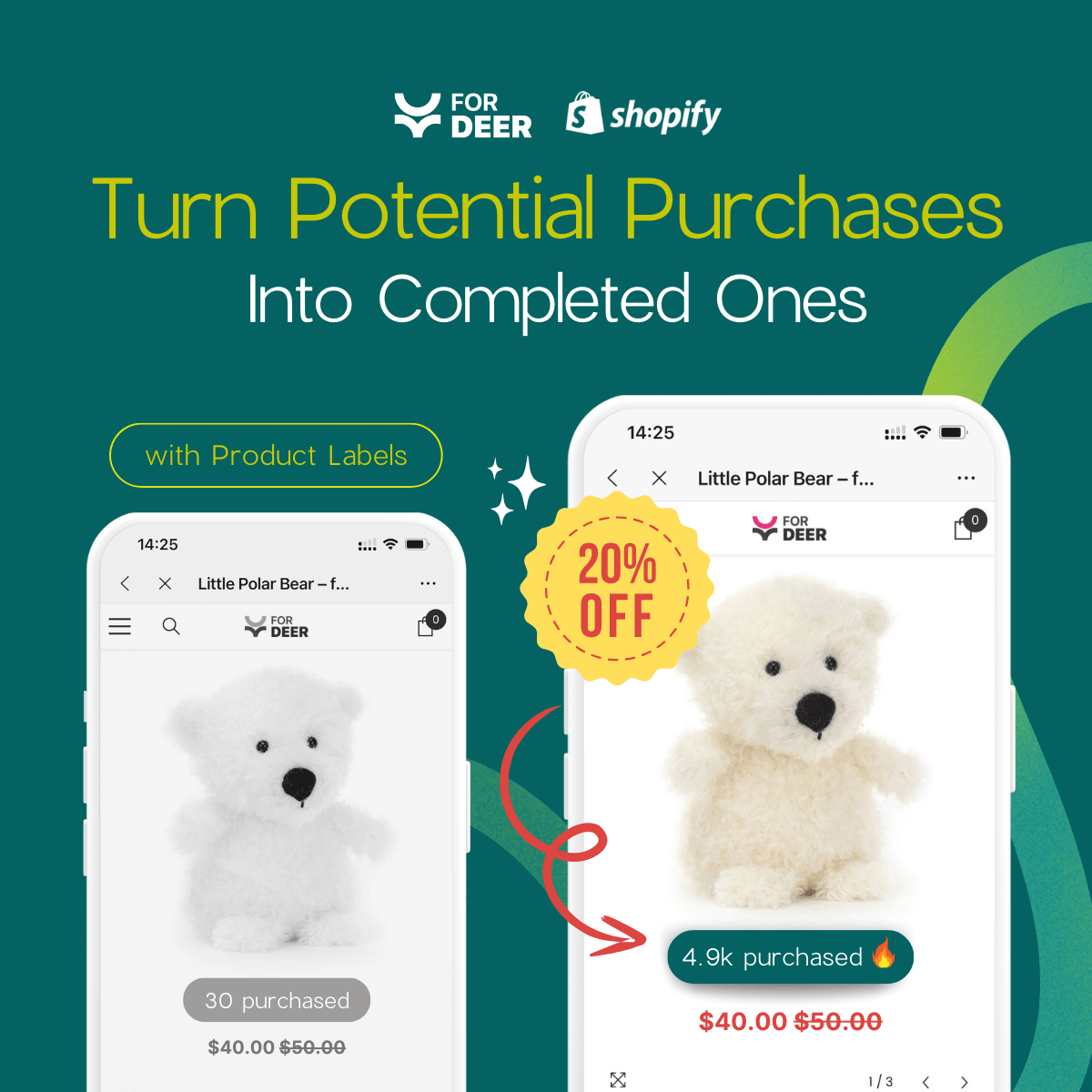
Using static images baked into your product photos is a massive operational bottleneck. Manual updates lead directly to human error. If a product goes out of stock but still displays a top seller tag, you frustrate customers and lose credibility.
How to implement:
- Set condition-based rules: Use an app like Fordeer Product Labels to tag items that hit a specific sales threshold automatically.
- Master the setup: Read our complete Product Labels & Badges for Shopify: CRO Encyclopedia (2026) to understand advanced automation rules.
- Sync with inventory: Ensure labels disappear the moment stock runs low.
2. Use High-Contrast Color Psychology
Colors trigger immediate emotional responses. Your badges must pop off the screen without clashing with your overall brand identity.
Here is how to choose the right colors:
- Analyze your theme: If your store uses pastel or muted colors, a bright red or deep gold badge will immediately draw the eye.
- Match the emotion: Red creates a sense of urgency. Gold implies premium quality. Green suggests freshness or trending status.
- Maintain readability: Ensure the text contrast against the badge background meets accessibility standards. White text on a dark background usually performs best.
3. Keep Grid Design Clean on Mobile
Mobile shoppers have limited screen real estate. A label that looks perfect on a desktop monitor might completely cover the vital details of a product image on a smartphone.
Pro Tip: Position your labels in the top-left corner of the product image. Eye-tracking studies show this is exactly where western users look first when scanning a grid.
How to implement:
- Use relative sizing: Ensure your badge scales down proportionally on mobile devices.
- Test your padding: Leave enough breathing room between the label and the edge of the product card.
- Limit text length: Use short phrases like Top Rated rather than long descriptive sentences.
4. Combine with Scarcity Triggers
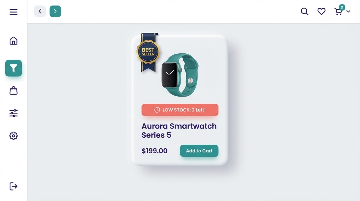
Layering psychological triggers compounds your conversion rate
Social proof tells them the item is highly rated. Scarcity tells them they need to buy it right now. Combining these two elements creates a highly persuasive shopping experience.
How to implement:
- Add dynamic variables: Display text like Best Seller - Only 3 Left.
- Highlight velocity: Use phrasing like Selling Fast alongside the main badge.
- Create FOMO: Show exactly how many people viewed or purchased the item in the last 24 hours.
5. Enforce Strict Label Limits
If everything is a best seller, nothing is a best seller. Over-labeling destroys the entire visual hierarchy you are trying to build and makes your store look spammy.
How to implement:
- The 10-15% rule: Never label more than 10 to 15 percent of the products in any single collection.
- Rank by category: Have one clear top performer per specific sub-category rather than grouping them all together.
- Prioritize margins: If two items have similar sales volume, assign the badge to the product with the higher profit margin.
6. A/B Test Your Phrasing
Not every audience responds to the exact same wording. The phrasing you choose changes the entire context of the recommendation.
Top phrasing variations to test:
- Authority-based: Staff Pick or Expert Choice
- Popularity-based: Customer Favorite or Trending Now
- Data-based: #1 in Category or Top 10
Run these different variations for a month each. Track which phrasing generates the highest click-through rate from your collection pages.
7. Rotate Labels for Seasonality
A product that was your top performer in July might not be relevant in November. Stagnant collection pages look abandoned. Customers who return to your store want to see fresh, relevant recommendations.
How to implement:
- Create seasonal collections: Set up dynamic categories like Holiday Best Sellers.
- Stand out visually: Learn exactly how product badges can make your products stand out and drive sales during specific promotional periods.
- Adjust timeframes: Calculate your top sellers based on the last 30 days rather than all-time historical data.
III. Common Mistakes to Avoid

Avoid these common merchandising pitfalls to protect your store's credibility
Even with the right strategies in place, poor execution can hurt your brand. Keep an eye out for these frequent missteps when organizing your collection pages.
1. Hardcoding Badges into Images
Never use Photoshop or Canva to burn best seller graphics directly into your core product photography. This creates a massive headache for catalog management. More importantly, it often leads to immediate Google Merchant Center disapprovals. Google Shopping requires clean product images without promotional text. Always rely on CSS or app-based dynamic overlays instead.
2. Clashing with Theme Design
Your badges need to stand out, but they should never look like they belong on a different website. Using low-quality or pixelated badge graphics instantly degrades trust. Neon or overly aggressive designs can make a premium brand look incredibly cheap. Emphasize brand alignment by using custom CSS to match your exact hex codes and typography.
3. Ignoring the Post-Click Experience
Nothing breaks trust faster than a disconnect between the collection page and the product page. If a user clicks a heavily promoted best seller but lands on a product page with zero reviews, they will immediately feel manipulated. Align your collection page promises with reality. Ensure your top-labeled items have high-converting product pages, detailed descriptions, and plenty of visible customer feedback.
IV. Conclusion
Optimizing your grid with a best seller label shopify collections strategy is one of the fastest ways to guide customer attention and boost your revenue. By automating your rules, limiting badge quantity, and keeping designs mobile-friendly, you completely remove the friction of decision fatigue.
You have the great products. Now it is just about directing your visitors straight to them. Start small by highlighting your top three items today, measure the click-through rates, and scale the strategy across your entire catalog as you see the results pour in. You've got this!
Follow the Fordeer Team for more useful updates!
- Install Fordeer Apps for Free
- Get immediate assistance by chatting with us
- Join Fordeer Commerce Community for fresh app updates, expert tips, and private deals.