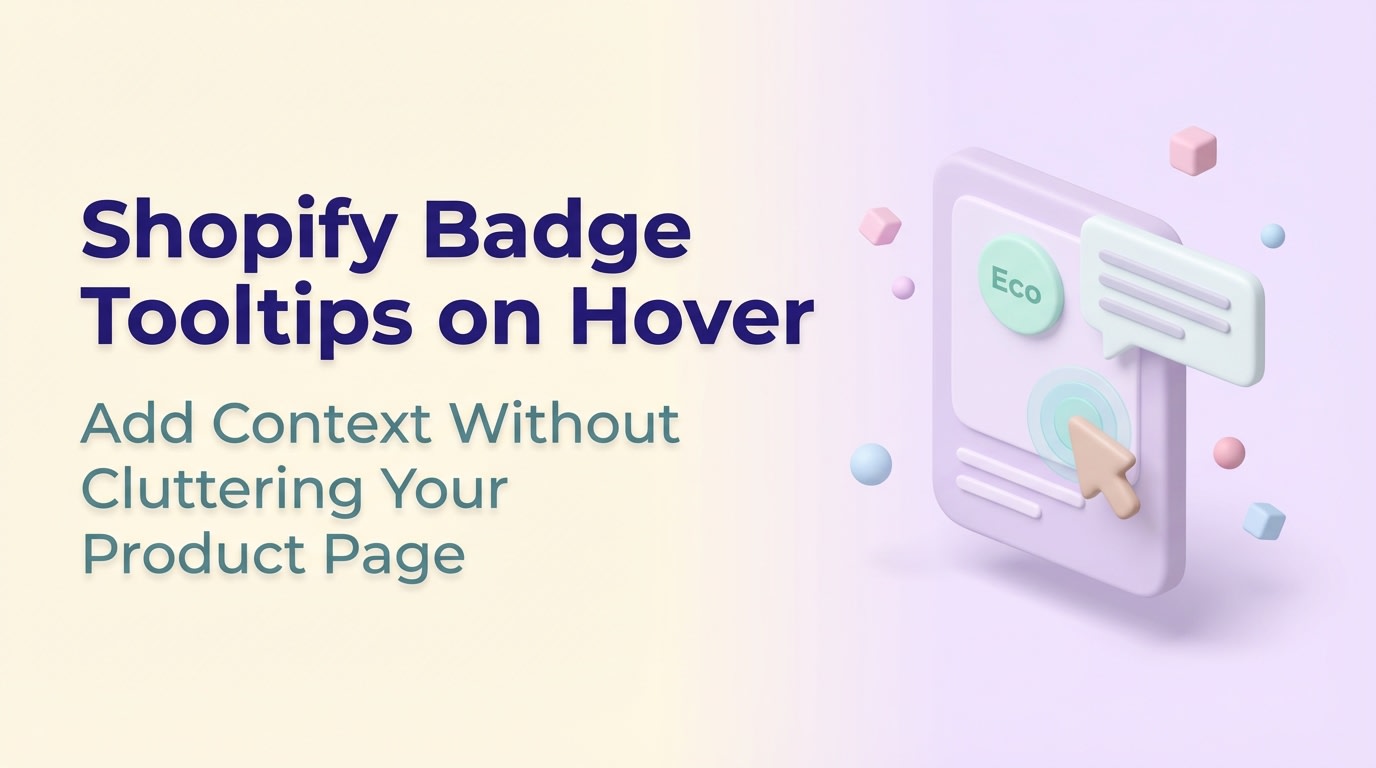
Shopify Badge Tooltips on Hover: Add Context Without Cluttering Your Product Page

Imagine adding a beautiful "Eco-Friendly" badge to your product page, only to realize your mobile shoppers have no idea what it actually means. With 70% of Shopify traffic coming from mobile devices, relying solely on a traditional mouse-hover effect leaves the majority of your customers in the dark.
Merchants frequently use product labels to highlight sales, trust signals, or specific features. Adding a shopify badge tooltip hover is the cleanest way to explain these tags without cluttering your interface. However, getting this to work dynamically on Online Store 2.0 themes (while respecting touchscreens) requires a specific approach.
In this article, we will break down exactly how to attach descriptive tooltips to dynamic product badges. We will cover the limitations of CSS hovers, mobile-first alternatives, and no-code solutions to get your badges communicating effectively. Let's get started!
I. Overview of Shopify Badge Tooltips
Using tooltips keeps your product cards clean while providing essential context.
Adding a small text bubble to a badge seems simple, but executing it correctly across a full catalog requires structural planning. Here is what you need to know before touching your theme code.
1. What Makes Badge Tooltips Different?
Standard static tooltips are usually hardcoded next to fixed text (like a shipping policy link). Badge tooltips are fundamentally different because they must adapt to dynamic elements.
Product badges are generated via Liquid tags or app blocks based on specific inventory conditions. Because badges appear and disappear based on stock levels or active sales, your tooltips must anchor directly to these shifting elements without breaking your grid layout.
2. The Shopify Polaris Standard
When building for Shopify, following the official Polaris design guidelines builds merchant and consumer trust. Polaris clearly defines how supplementary information should be displayed.
Here is the key distinction:
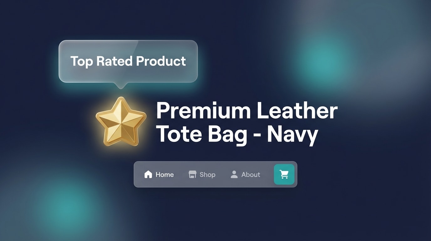
- Tooltips: Designed for short, descriptive text (under 10 words). They explain what a specific icon or badge means.
- Popovers: Designed for rich content like forms, links, or multi-sentence paragraphs.
Keeping your badge tooltips aligned with Polaris standards ensures your interface remains intuitive and professional.
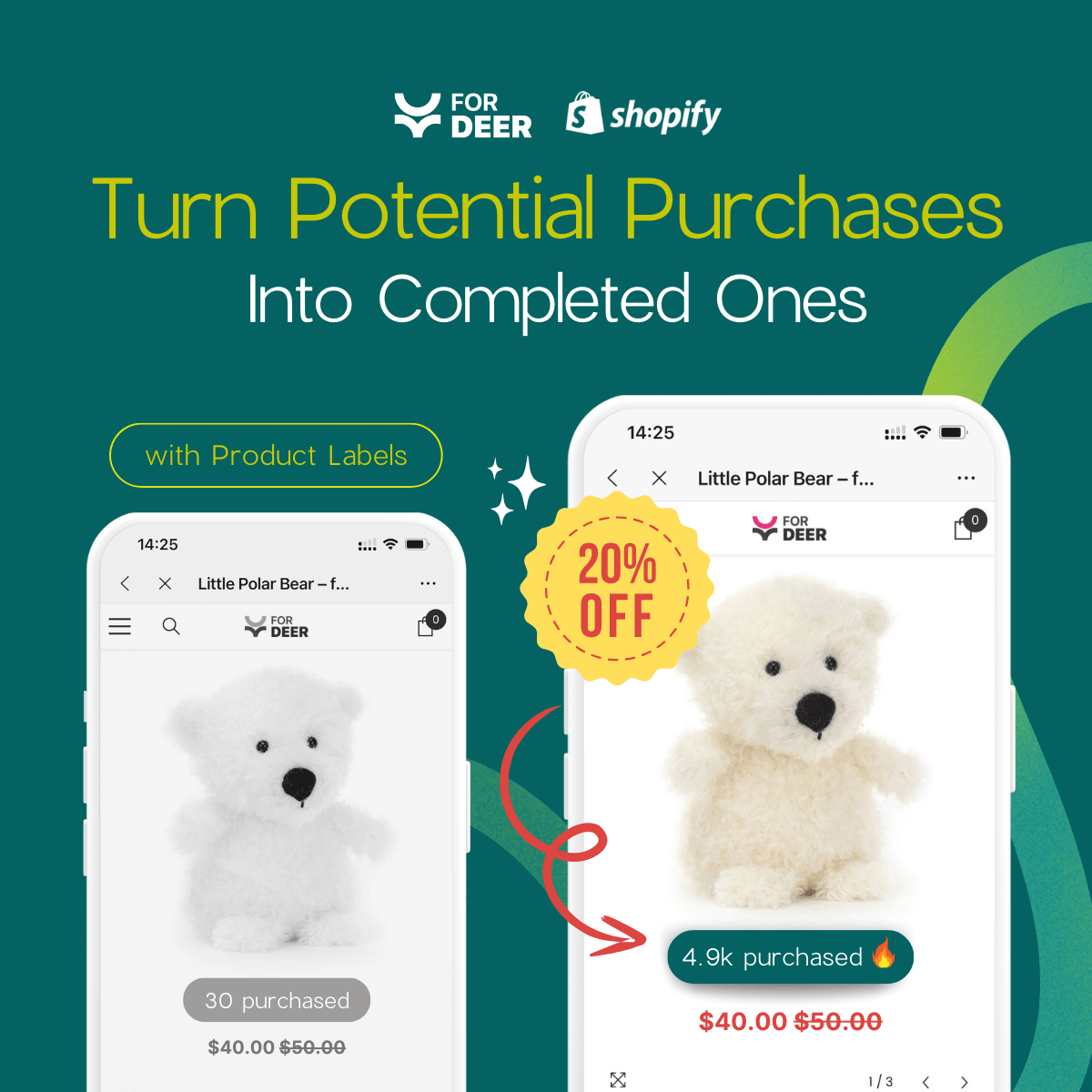
3. Why Contextual Badges Drive Sales
Unexplained badges create cognitive load. If a customer sees a "Limited Edition" badge but doesn't know why it's limited, the badge loses its psychological impact.
Contextual tooltips solve this by providing immediate clarity. They explain the value proposition without requiring the user to scroll down to the product description. To see real-world examples of this strategy in action, check out our guide on how product badges can make your products stand out and drive sales.
II. The Mobile Challenge with Hover States

Hover states do not exist on smartphones, requiring a touch-first alternative.
The biggest mistake merchants make when adding tooltips is designing exclusively for desktop users. A standard CSS hover effect is practically useless for modern eCommerce traffic.
1. The 70% Mobile Traffic Reality
Shopify's internal data consistently shows that nearly 70% of all platform traffic originates from mobile devices. The fundamental limitation here is that the CSS :hover pseudo-class does not translate accurately to touchscreens.
When you rely solely on a desktop-style hover, mobile users experience "sticky hovers". They tap a badge, the tooltip appears, but it refuses to disappear when they scroll away. This blocks product images, frustrates shoppers, and directly harms your conversion rate.
2. Moving from "Hover" to "Trigger"
To solve the mobile problem, you must shift your mindset from a single "hover" state to a multi-trigger approach. Modern Shopify themes (like Pipeline or Dawn) handle touch states by capturing multiple interaction types.
A reliable tooltip must listen for three distinct actions:
- Hover: For desktop users moving their mouse.
- Focus: For keyboard navigation and accessibility.
- Tap: For mobile touchscreen users.
Relying on outdated forum tutorials that only utilize .badge:hover will inevitably break your mobile layout. You need a modern, multi-trigger solution.
III. 5 Strategies to Implement Hover Text on Shopify Badges
Implementing a reliable shopify badge tooltip hover requires balancing performance with ease of use. Depending on your technical comfort level, here are the most effective ways to build this functionality.
1. Use CSS-Only Tooltips for Maximum Speed

CSS-only tooltips prevent render-blocking JavaScript from slowing down collection pages.
Heavy JavaScript can cripple your store's loading speed. This is especially true on collection pages displaying dozens of product badges simultaneously.
Why this matters: CSS-only implementations are lightweight and instantly responsive. They completely avoid the "flicker" often caused by JavaScript loading delays.
Here is how you structure a fast-loading CSS tooltip:
- Structure your HTML: Wrap your primary badge inside a relative container (
<div class="badge-container">). - Position the tooltip: Use
position: absolutefor the hidden text span containing your explanation. - Control visibility: Set the tooltip to
opacity: 0andvisibility: hiddenby default. Toggle them to visible on:hover.
CSS-only methods are highly performant but require manual Theme editor adjustments and careful styling.
2. Implement Touch-Friendly CSS Toggles
Since traditional hovers fail on mobile, you need a CSS fallback that registers screen taps without requiring complex custom JavaScript listeners.
Why this matters: Capturing the 70% of mobile users who need context for your badges ensures you don't lose conversions due to UI confusion.
Here is how to make your CSS mobile-friendly:
- Add the
:focusstate: Update your stylesheet to trigger the tooltip on both.badge:hoverand.badge:focus. - Use
tabindex: Addtabindex="0"to your badge HTML element. This tells mobile browsers to treat the badge as a tappable, focusable element. - Add the
:activestate: For older mobile browsers, ensuring the:activepseudo-class mirrors the hover state provides a foolproof fallback mechanism.
3. Connect Tooltips to Dynamic Product Tags (Liquid)
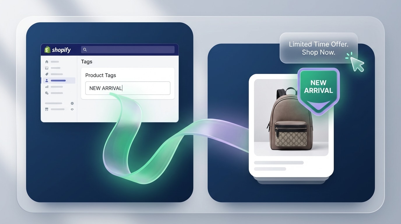
Mapping tooltips to specific Liquid tags automates your workflow.
Hardcoding tooltips into your theme files is inefficient. You need tooltips that dynamically update based on the product's assigned tags in the Shopify Admin.
Why this matters: Dynamic rendering allows you to manage tooltips directly from your product dashboard. You set up the logic once, and the system handles the rest.
Follow these steps to build dynamic Liquid tooltips:
- Open your
product-card.liquidsnippet in the theme editor. - Create a Liquid
casestatement that loops throughproduct.tags. - Assign text conditions based on the tag (outputting "15% Off All Season" if it detects the "Sale" tag).
- Inject the matched text into a
data-tooltipattribute on the visual badge span.
Pro Tip: Use Shopify Metafields instead of standard Tags for longer tooltip explanations. This keeps your internal tag management system perfectly clean.
4. Utilize the Polaris React Component (For Developers)
If you are building a custom headless storefront or designing a custom app interface, you should leverage Shopify's built-in design language directly.
Why this matters: Using the official Polaris React Library ensures future-proof compatibility with Shopify's ecosystem. It also guarantees automatic accessibility compliance right out of the box.
How to implement:
First, import the Tooltip component from @shopify/polaris. Next, wrap your custom badge component inside the imported Tooltip tags. Finally, define your hover text directly in the content="Your text here" prop.
This method is incredibly powerful because Polaris automatically handles edge detection. If a badge sits at the far right of the screen, the component shifts the tooltip left, ensuring it never renders off-screen.
5. Use a No-Code Visual Badge Builder
Editing theme.liquid files and managing CSS classes isn't for everyone. A visual builder is the absolute safest route for merchants who want to avoid accidentally breaking their Online Store 2.0 theme.
Why this matters: App-based solutions let you launch contextual badges in minutes. They come with mobile-responsive tooltips built-in, requiring zero technical knowledge to deploy.
How to implement:
Install a dedicated application like Fordeer: Product Labels & Badges. Choose a badge style from the library and assign it to specific collections or inventory conditions. Simply type your tooltip explanation into the visual settings dashboard. The app handles all the complex mobile logic, z-index layering, and CSS performance optimization behind the scenes.
For a comprehensive look at maximizing conversions with visual tags, read our Product Labels & Badges for Shopify: CRO Encyclopedia (2026).
IV. Accessibility and Styling Best Practices
Accessible tooltips ensure every customer can understand your product features.
Once your tooltips are functioning, you must ensure they render correctly across all devices. They must also remain accessible to shoppers using screen reading software.
1. Master the Z-Index Hierarchy
The most common visual bug with custom tooltips is when the text bubble hides behind a product image or the site header menu. This happens because the stacking context is broken.
To fix this, establish a new stacking context on the parent badge container (position: relative; z-index: 10;). Arbitrarily setting your tooltip to z-index: 9999 causes massive conflicts with theme popups and sticky headers. Keep your z-index values low and deliberate.
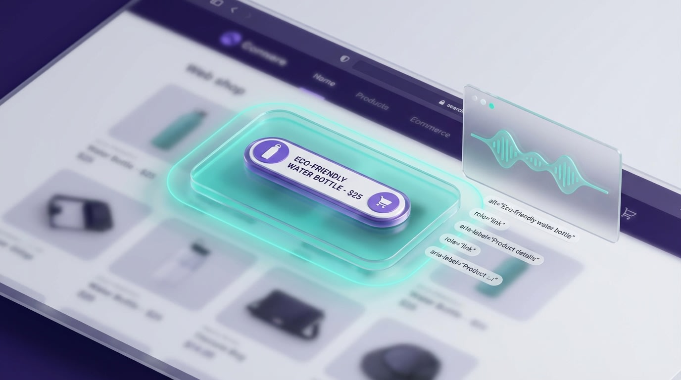
2. Implement W3C Accessibility Standards
A tooltip is useless if visually impaired customers cannot access it. Web accessibility is a requirement for modern eCommerce.
First, use ARIA labels specifically for non-text badge elements (like a star or leaf icon). Next, use the aria-describedby attribute on the badge to link it directly to the tooltip's unique ID. Finally, include the role="tooltip" attribute on the hidden text span. This ensures screen readers announce the hover text properly when the user focuses on the badge.
3. Keep Tooltip Typography Legible
Design matters just as much as code. A tooltip that is hard to read will cause shoppers to abandon the page.
Here is how to optimize tooltip typography:
- Contrast ratios: Ensure the tooltip background contrasts sharply with both the text color and the product image behind it (dark grey with white text works best).
- Sizing: Keep your tooltip text between 12px and 14px to maintain readability on small screens.
- Word count: Limit your tooltip content to under 10 words. If you need a longer explanation, use a clickable popover modal instead.
V. Conclusion
Adding a shopify badge tooltip hover is one of the most effective ways to provide product context without ruining your store's clean aesthetic. Whether you choose a lightweight CSS-only approach, dive into Liquid tags, or opt for a visual app builder, the key is ensuring the experience translates flawlessly to mobile devices.
You don't have to be a master developer to improve your store's user experience. Start small by adding descriptive tooltips to your most important trust badges. You will quickly see how clarifying that information positively impacts your conversion rates. You've got this!
Follow the Fordeer Team for more useful updates!
- Install Fordeer Apps for Free
- Get immediate assistance by chatting with us
- Join Fordeer Commerce Community for fresh app updates, expert tips, and private deals.