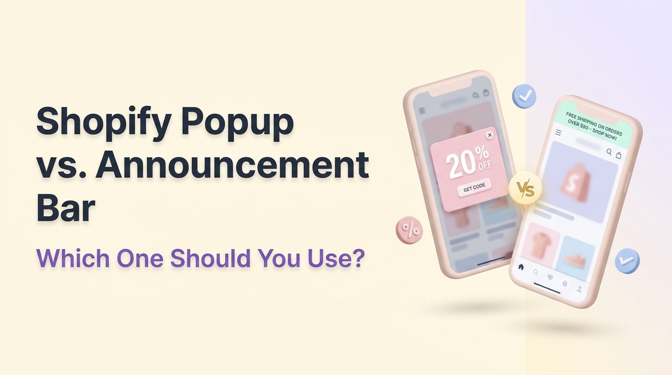
Shopify Popup vs. Announcement Bar: Which One Should You Use?


Picture this: A shopper lands on your store via their iPhone, only to be immediately slapped with a full-screen discount offer, a chat widget, and a sticky header. They cannot even see your product image. Frustrated, they bounce. This UI suffocation is costing merchants thousands in lost sales every single day.
When building an ecommerce CRO strategy, choosing between a shopify popup vs sticky bar is one of the most critical UI decisions you will make. While both elements are powerful for lead capture and driving sales, deploying them incorrectly leads to slow page speeds, Google penalties, and annoyed customers.
In this guide, we will break down the exact performance differences between these two tools. You will learn how to conduct a mobile viewport audit, solve common Z-index overlaps, and discover seven proven strategies to boost your conversion rates without ruining the shopping experience. Let's get started.
I. Overview of Popups vs Sticky Bars
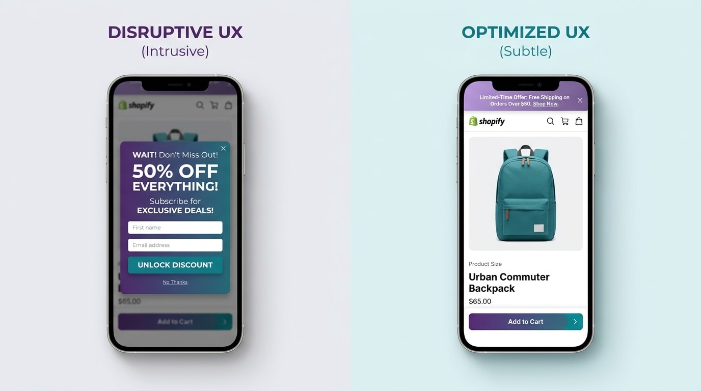
Comparing the visual footprint of popups and sticky bars on a standard mobile viewport.
1. Popups: The Lead Capture Hunter
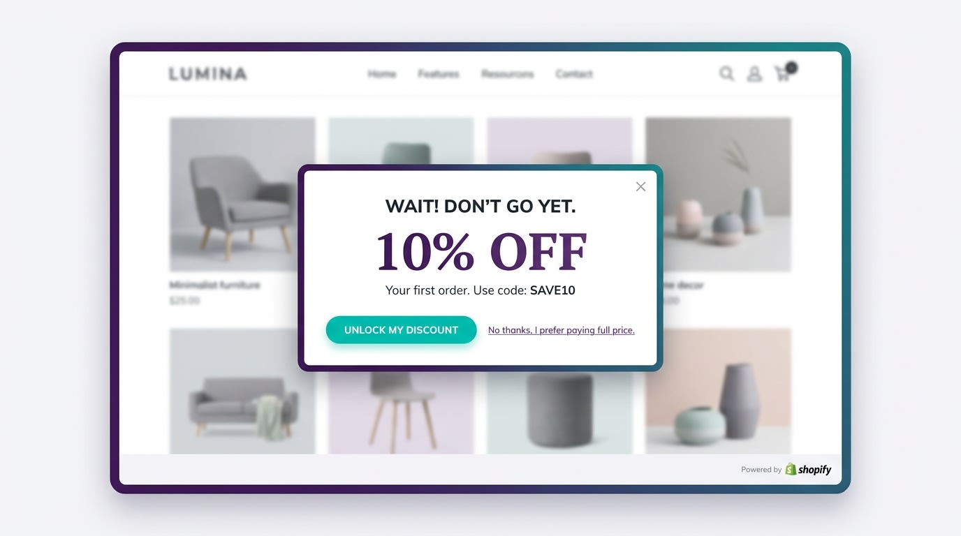
Popups are active, interruptive marketing tools designed to demand immediate user attention. They force the shopper to make a distinct choice: engage with the marketing offer or close the window to continue browsing.
Their primary use case is email lead capture and exit-intent recovery. The numbers back this up significantly. According to Klaviyo industry benchmarks, well-timed exit-intent popups can recover up to 10-15% of abandoning visitors. That is pure recovered revenue from traffic you already paid to acquire.
This strategy is high-reward but high-risk. If you time your active UI poorly, bounce rates will spike as annoyed customers leave. You must configure them correctly based on user behavior. To get this right, read our guide to Master Your Conversions: The Ultimate Guide to Effective Popup Triggers for Shopify.
2. Sticky Bars: The Passive Sales Farmer
Sticky bars (also known as announcement bars or a sticky add to cart bar shopify) take a completely different approach. They remain visible at the top or bottom of the screen as the user scrolls, offering passive reminders without interrupting the shopping experience.
These tools are incredibly effective for mobile users who need constant access to checkout buttons. Data from Easyappsecom shows that sticky add-to-cart bars increase Shopify conversion rates by 8-15% on mobile devices.
They also serve as excellent tools for passively raising your Average Order Value (AOV). You can use them to display subtle free shipping thresholds or active promo codes that encourage shoppers to add just one more item to their cart before checking out.
3. The Google Intrusive Interstitial Penalty
You must consider SEO when choosing your UI tools. Google Search Console has strict guidelines regarding intrusive interstitials that ruin the mobile browsing experience.
If you display a full-screen popup on mobile that blocks primary content immediately upon page load, Google will penalize your search rankings. Your store will lose valuable organic traffic because Google views your site as user-hostile.
Sticky bars are generally much safer for SEO compliance. They take up significantly less screen real estate and do not block the user journey. The customer can still read product descriptions and view large images while the bar sits quietly at the edge of their screen.
II. The Viewport Audit: Speed and Mobile Real Estate

The Z-Index War: Administrative UI can easily consume 25% of your mobile screen.
1. The Mobile Z-Index War
Mobile real estate optimization shopify is a critical skill for modern merchants. Most mobile screens are only 600-900 pixels high, leaving very little room for error.
Do the math on your active elements. A standard sticky header (80px) plus a sticky bar (60px) plus a chat widget (60px) easily consumes over 25% of the visible viewport. Customers experience severe UI blindness when faced with this much administrative clutter.
Worse, overlapping elements create a sticky bar z-index fix nightmare. The z-index controls which elements sit on top of others. If your chat widget has a higher z-index than your checkout button, the widget sits on top. Customers literally cannot click to pay.
Perform a physical audit today. Open your store on an iPhone 15. Scroll through a product page and see exactly how much product image remains visible. If administrative tools hide your product, you are actively losing sales.
2. Popup Page Speed Impact Analysis
Visual clutter is only half the problem. You must also measure the hidden technical cost of these overlapping UI tools.
Loading heavy popup scripts directly impacts your Core Web Vitals. They increase JavaScript Execution Time and cause Cumulative Layout Shift (CLS). CLS happens when a popup loads late and pushes your buy button down just as a customer tries to click it. Every second of delay drops your conversion rate.
A simple CSS sticky bar is lightweight and loads instantly. A complex, animation-heavy popup app forces the browser to work much harder to render the page.
Here is a technical tip. Evaluate the script weight (KB) and request count when choosing between standalone apps versus multi-tools. Lightweight code means faster page speeds, better SEO, and higher overall conversions.
III. 7 Strategies to Maximize Conversions Without Annoying Users
Choosing the right tool is only half the battle. How you implement your Shopify popup vs sticky bar dictates whether you will see an 8-15% conversion lift or a massive spike in bounce rates.
1. Use Popups Strictly for High-Intent Lead Capture
Save your popups for moments when the customer is actually ready to engage.
Popups are interruptive by nature, so they must offer undeniable value. Never show a popup the second a user lands on your site.
Why this matters: Immediate popups trigger the intrusive interstitial penalty shopify and frustrate users who have not even seen your products yet. You are asking for an email before proving your store is worth their time.
How to implement:
- Set scroll delays: Wait until the user has scrolled at least 50% down the page. This proves they are actively reading your product descriptions.
- Trigger on exit-intent: Only show the popup when the mouse moves toward the browser back button or address bar. This captures attention right before they bounce.
- Keep fields minimal: Ask for an email address only. Every additional field drops conversion rates drastically.
This ensures you are hunting for leads without ruining the browsing experience.
2. Deploy Sticky Add-to-Cart Bars for Mobile Buyers
Mobile shoppers are easily distracted. If they have to scroll all the way back up a long product description to buy, you might lose them to a text message or social media notification.
Why this matters: A sticky add to cart bar shopify keeps the primary conversion action accessible at all times, leading to that proven 8-15% conversion lift. Review our guide on Effective Sales Popup Practices to Boost Sales and Conversions for more layout ideas.
How to implement:
- Anchor to the bottom: Place the bar at the bottom of the screen on mobile where thumbs naturally rest. Top bars are harder to reach on large phones.
- Include variant selection: Ensure the bar allows users to pick sizes or colors directly. Forcing them back to the top defeats the purpose.
- Keep it high-contrast: Make the button color pop against your store background so it stands out clearly.
3. Never Stack Active UI Elements Simultaneously
If you have a welcome popup, an announcement bar, a sticky header, and a chat bubble all firing at once, your store looks like spam.
Why this matters: Stacking UI elements creates friction and ruins the mobile shopping experience. Customers will leave rather than fight through layers of administrative windows.
How to implement:
- Prioritize the view: If a popup triggers, dim the background and ensure the sticky bar is hidden until the popup is closed.
- Check your code: Use a sticky bar z-index fix to ensure your chat widget does not overlap your add-to-cart button. Set your sticky bar to a lower z-index than critical checkout buttons.
- Rule of one: Only present one active marketing message per page view. Do not ask for an email and promote free shipping simultaneously.
Pro Tip: Open your store on your mobile phone right now. If administrative UI takes up more than 20% of the screen, you need to turn something off.
4. Optimize Real Estate for Express Checkout Buttons
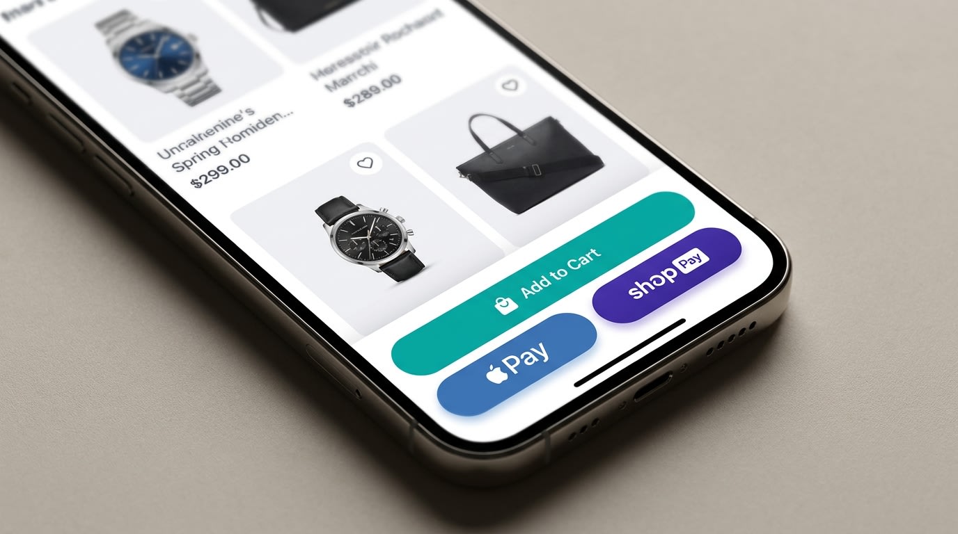
Ensure your sticky bars do not conflict with express checkout options.
Many merchants forget that digital wallets add their own dynamic buttons to the mobile viewport natively through Shopify.
Why this matters: If your sticky bar overlaps with Shop Pay or Apple Pay dynamic buttons, customers literally cannot complete their purchase. This causes immediate cart abandonment.
How to implement:
- Test dynamic checkouts: Manually test your store with Apple Pay and Google Pay active on an actual mobile device, not just a desktop simulator.
- Adjust bottom padding: Add CSS padding to your sticky bar to ensure it sits cleanly above express checkout options without covering them.
- Simplify the bar: Remove social icons or secondary links from the sticky bar to keep the focus purely on the transaction.
5. Segment by Device: Mobile Bars vs Desktop Popups
What works beautifully on a 27-inch monitor is often a complete disaster on a 6-inch phone screen. You must treat these layouts differently.
Why this matters: Mobile friendly popups exist, but desktop offers far more forgiving screen real estate for complex lead capture forms. Squeezing a massive graphic into a mobile view ruins usability.
How to implement:
- Desktop strategy: Use center-screen, image-rich popups for your main lead capture campaigns. You have the space to show off product lifestyle photos.
- Mobile strategy: Swap full popups for sleek, top-of-screen announcement bars or simple slide-in notifications that do not block the main product image.
- Check app settings: Ensure the app you choose allows device-level targeting and segmentation. Turn off desktop popups for mobile users completely.
6. Clean Up Ghost Code After Uninstalling Apps
Merchants often test five different apps before settling on one, leaving behind a massive trail of bloated JavaScript in their theme files.
Why this matters: Ghost code from deleted apps slows down your store, causes severe popup page speed impact issues, and creates weird visual glitches that break your layout.
How to implement:
- Check theme.liquid: Look for leftover script tags from old popup apps in your theme code. Search for the app developer names.
- Duplicate your theme: Always create a backup of your live theme before manually deleting old code to prevent breaking your store.
- Use native uninstalls: Follow the specific uninstallation guide provided by the app developer rather than just clicking delete from your Shopify admin panel.
7. Consolidate Your Tech Stack with a Multi-Tool App
Paying $15 per month for a popup app, $10 per month for an announcement bar, and $20 per month for a sticky add-to-cart app is a massive waste of resources.
Why this matters: Multiple apps mean multiple scripts loading independently on your store. This drags down site speed and drastically increases the chance of app conflicts.
How to implement:
- Audit your subscriptions: List every single UI app you currently pay for and calculate the total monthly cost.
- Find a unified solution: Look for an all-in-one suite that handles popups, sticky bars, and banners from a single, centralized dashboard.
- Leverage Fordeer: Consider tools like Fordeer Sales Pop Up to manage all your active and passive marketing elements under one lightweight, speed-optimized roof.
IV. Conclusion
So there you go. When evaluating a shopify popup vs sticky bar, remember that you do not have to choose just one. You simply have to use them strategically. Popups are your heavy-hitting hunters for lead generation, while sticky bars are your passive farmers for driving conversions and raising AOV. By respecting your customer's mobile screen real estate and monitoring your page speed, you can easily increase sales without causing frustration.
You do not have to tackle everything at once. Start by auditing your mobile view today and implementing a clean, consolidated UI strategy. You've got this!
Follow the Fordeer Team for more useful updates!
- Install Fordeer Apps for Free
- Get immediate assistance by chatting with us
- Join Fordeer Commerce Community for fresh app updates, expert tips, and private deals.