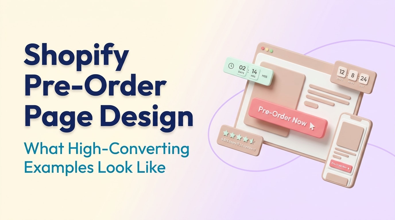
Shopify Pre-Order Page Design: What High-Converting Examples Look Like

There is nothing more frustrating than building massive hype for an upcoming product, only to lose momentum because your landing page feels confusing or unverified. When customers face an "Out of Stock" badge or a vague "Coming Soon" message, they bounce.
Running a successful campaign requires more than just slapping a new button on your product template. From technical SEO drops to navigating strict shipping laws, merchants need high-converting landing pages that build trust and urgency. Looking at proven shopify pre-order page design examples is the fastest way to understand what works for modern consumers.
In this guide, we break down the hidden legal and SEO traps of presales, analyze real-world examples, and provide actionable design strategies to help you secure revenue long before your inventory arrives. Let us dive in.
I. The Hidden Traps: Pre-Order SEO and Legal Compliance
Protecting your rankings and staying legally compliant are the real first steps of any pre-order strategy
1. The Pre-order SEO Paradox
Many merchants unknowingly sabotage their search rankings during a product launch. When a Shopify product goes from "In Stock" to "Pre-Order", Google often reads it as "Out of Stock". This causes your hard-earned organic search rankings to plummet overnight.
How to fix it:You must update your Schema.org markup. Change the availability attribute to PreOrder rather than OutOfStock. This technical adjustment ensures search engines understand your product is still available for purchase, maintaining your SEO stability while you wait for inventory.
2. Navigating the FTC 30-Day Rule
Protecting your business legally is just as critical as your design. For US merchants, the Federal Trade Commission (FTC) enforces a strict 30-day rule for shipping. You must have a reasonable basis for the shipment dates you state on your landing page. If you cannot ship within that window, you must notify the customer and offer a full refund.
Why this matters: Visual clarity prevents chargebacks. You must display estimated shipping dates prominently near the checkout button. Following A Step-by-Step Guide to Launch Successful PreOrder Campaigns ensures you structure these timelines properly, keeping you out of legal trouble while building buyer confidence.
II. High-Converting Shopify Pre-Order Page Design Examples
It is easy to get lost searching through Reddit threads for the best shopify pre order page design examples. Instead of downloading random templates, let us look at the core elements that top-tier eCommerce brands use to drive conversions.
Analyzing how top brands structure their pre-launch landing pages
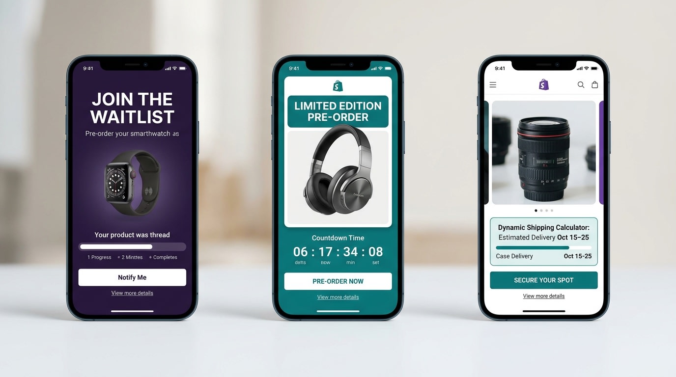
1. The Scarcity Approach
Sneaker drops and limited-edition streetwear brands excel at this model. They rely entirely on visual scarcity to force immediate action.
- Countdown Timers: Place a ticking clock right above the primary call-to-action (CTA).
- Inventory Limits: Show exactly how many units are left in the current production run.
- The Result: This design reduces cart abandonment because shoppers know they will miss out if they wait.
2. The Transparent Timeline
Tech gadget companies and hardware brands often use a timeline-focused design. Customers buying expensive items that take months to manufacture need constant reassurance.
- Visual Progress Bars: Show the product moving from "Manufacturing" to "Quality Control" to "Shipping".
- Clear Dates: Place explicit, legally compliant shipping dates right next to the price.
- The Result: This transparency drastically reduces post-purchase support tickets and customer anxiety.
3. The Exclusive Waitlist
Luxury apparel brands often use a gated approach. They shift the standard "Buy Now" mentality to an "Apply for Access" model.
- Gated Access: Require customers to enter their email to unlock the presale button.
- VIP Tiers: Offer early access to existing community members.
- The Result: You build a highly engaged email marketing list while accurately gauging production demand before you spend money on manufacturing.
III. 8 Design Strategies to Optimize Your Pre-Order Landing Page
Having a great product is only half the battle. To maximize your upfront revenue, implement these specific conversion rate optimization tactics into your page design.
1. Master Your Button Microcopy
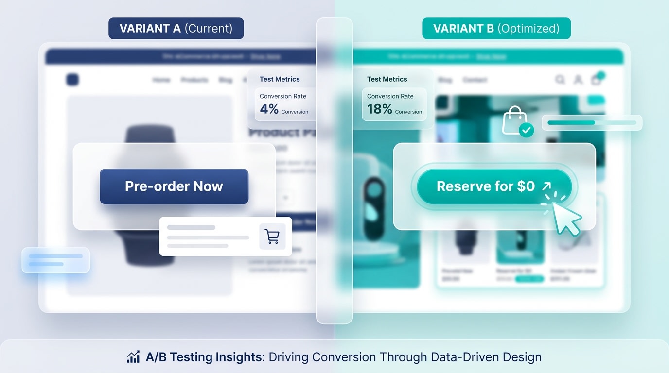
Small changes in your call-to-action text can drastically alter conversion rates
Your primary CTA button is the most critical element on the page. Generic "Add to Cart" buttons with tiny disclaimers hidden in the description are the number one cause of customer confusion.
Here is how to optimize:
- Test "Pre-order Now": Best for items with a definitive, short-term release date.
- Test "Reserve for $0": Highly effective for high-ticket items building long-term hype.
- Test "Join the Waitlist": Ideal when gauging initial production runs.
2. Lock Down the "Above the Fold" Experience
Your mobile visitors should never have to scroll to understand that an item is a presale.
Here is what to do:
- Keep the estimated shipping date immediately below the product title.
- Use a contrasting color for the CTA button to differentiate it from your standard "In Stock" items.
- Ensure the primary button is impossible to miss on mobile screens.
3. Build Immediate Social Proof
Shoppers need validation before handing over their money for a promise. Getting reviews for a product that has not shipped yet requires creativity.
Here is how to build trust:
- Showcase user-generated content from early beta testers or influencers.
- Display live sales notifications (e.g., "14 people reserved this in the last hour").
- Highlight media mentions prominently below the product image.
Pro Tip: If you have zero product reviews, leverage your overall brand reputation. Display a badge that says "Trusted by 10,000+ customers" to transfer trust to the new item.
4. Seamlessly Integrate with Shopify Themes
Modifying Shopify themes like Dawn or Refresh manually using code can easily break your store's mobile responsiveness.
Instead of hiring a developer to hardcode your templates, rely on purpose-built apps. Tools like the Fordeer PreOrder app allow you to automatically swap the checkout button and manage inventory thresholds. Pair this seamless technical setup with Marketing Strategies to Boost PreOrder Sales to drive massive traffic to your newly optimized landing page.
5. Design for Mobile-First Urgency
With over 70% of Shopify traffic coming from mobile devices, a clunky mobile form will kill your conversion rate.
Optimize for mobile flow:
- Sticky CTAs: Keep the pre-order button anchored to the bottom of the mobile screen as the user scrolls.
- Thumb Zone Design: Ensure all variant selectors for size and color are easily tappable with one hand.
- Collapsible FAQs: Use accordion menus for shipping details to save valuable screen real estate.
6. Incorporate Visual Scarcity
Scarcity is the engine of a successful campaign. You need to make the limited availability obvious at a glance.
Add these visual cues:
- Inventory Bars: Display a visual progress bar showing "Only 45 out of 100 slots remaining."
- Tiered Pricing Graphics: Visually cross out higher prices for early adopters (e.g., "Early Bird: $50, Retail: $80").
- Time Limits: Use clean, non-intrusive countdown timers tied directly to your production cutoff date.
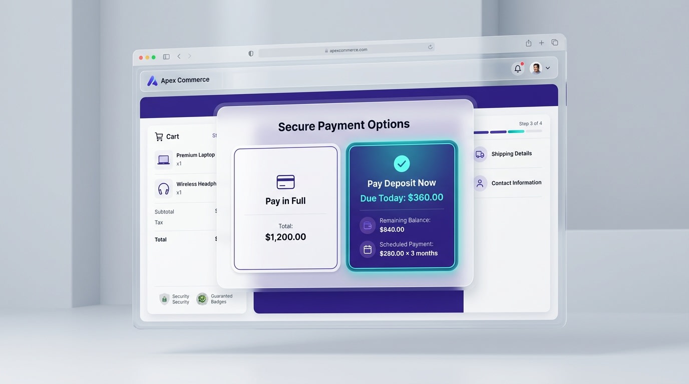
7. Clarify the Payment Model Visually
Make sure customers know exactly when their credit card will be charged
If you take full payment upfront, state it clearly near the price. If you allow a partial deposit, use icons to explain the payment flow (e.g., "Pay 20% now → Pay 80% when it ships"). Integrating visual badges like ShopPay or Klarna directly under the CTA can increase presale conversions significantly.
8. Optimize the Post-Purchase Communication Design
The pre-order experience does not end at checkout. Your "Thank You" page and confirmation email are vital extensions of your design.
Ensure your post-purchase page reiterates the shipping timeline boldly. Include a calendar file download (.ics) so customers can add the expected shipping date directly to their digital calendars. This simple feature drastically reduces customer support inquiries.
IV. Additional Consideration: Choosing Your Payment Strategy
Before launching your high-converting landing pages, you must align your UI design with your business model. There are generally two ways to structure payments on Shopify.
1. Full Payment Upfront
This model is best for lower-ticket items or highly anticipated drops from established brands. It secures your cash flow immediately to fund production. However, it requires maximum trust from your audience. Your design must lean heavily on social proof, secure checkout badges, and crystal-clear refund policies to offset the buyer's perceived risk.
2. The Deposit / Pay Later Model
For luxury items or high-ticket electronics, asking for massive payments months in advance will skyrocket your bounce rate. Offering a "Reserve for $50" option captures intent with minimal friction. From a design perspective, you must visually map out the timeline for the customer so they know exactly when the final invoice will hit their inbox.
V. Conclusion
So there you go—crafting a Shopify pre-order page that actually converts is about much more than beautiful imagery. By addressing the technical SEO, ensuring FTC compliance, and executing strategic UX design elements, you can turn uncertainty into eager anticipation.
You do not have to be a master developer to make this happen! With the right tools and a customer-first design approach, you can validate your products and secure cash flow before inventory even hits your warehouse. Take these strategies, optimize your pages, and watch your pre-launch revenue grow.
Follow the Fordeer Team for more useful updates!
- Install Fordeer Apps for Free
- Get immediate assistance by chatting with us
- Join Fordeer Commerce Community for fresh app updates, expert tips, and private deals.