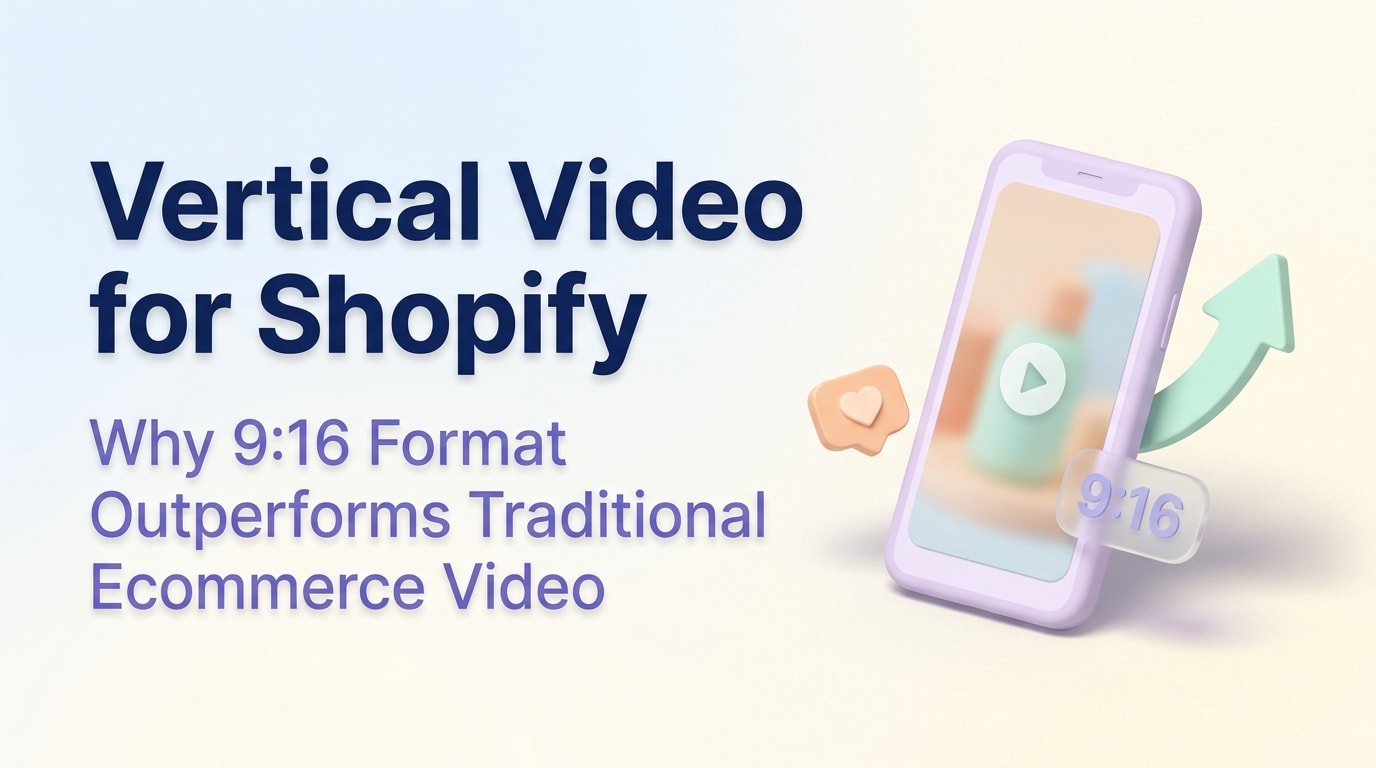
Vertical Video for Shopify: Why 9:16 Format Outperforms Traditional Ecommerce Video

With 80% of Shopify sessions now taking place on mobile devices, standard horizontal videos cost you conversions. Shoppers have been trained by social media to expect immersive, full-screen experiences. Static images simply do not capture attention the way they used to.
However, implementing a shopify vertical video mobile commerce strategy is rarely straightforward. If you force a 9:16 aspect ratio onto a desktop view, it looks massive and broken. Unoptimized video files can completely destroy your page load speed, hurting both user experience and search rankings.
In this guide, we break down the differences between using manual code and dedicated video apps. You will learn actionable strategies to serve mobile responsive video effortlessly, allowing you to create high-converting shoppable feeds without sacrificing performance.
Let's get started!
I. Overview of Vertical Video in Mobile Commerce
Shoppable vertical feeds replicate the social media experience directly on your store.
Integrating vertical video transforms your store from a static catalog into an engaging shopping experience. Here is what you need to know about this format.
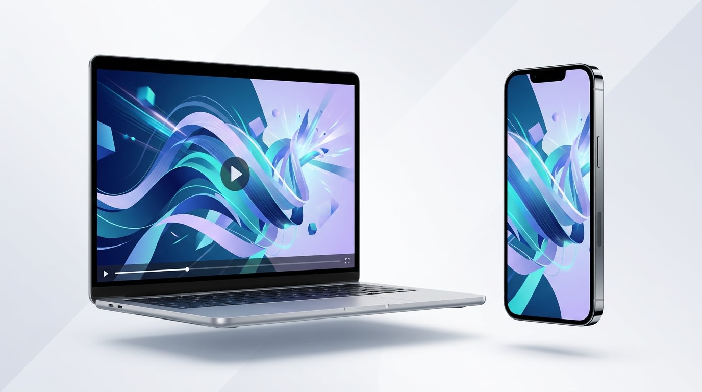
1. The Shift to 9:16 Aspect Ratios
A 9:16 aspect ratio perfectly matches the dimensions of a vertical smartphone screen. Platforms like TikTok and Instagram Reels completely changed buyer expectations. Consumers now prefer to scroll vertically through immersive content. Data shows that the vertical format has four times higher completion rates on mobile devices compared to traditional landscape videos.
2. The Dawn Theme Limitation
Most Shopify Online Store 2.0 native video sections default to a standard 16:9 widescreen format. When you upload a tall video into these default blocks, the platform often crops the top and bottom or stretches the file awkwardly across different viewports. This creates massive frustration for store owners trying to adjust dimensions manually.
3. Why Store Speed Matters Now
Adding rich media directly impacts your Google Core Web Vitals. The Largest Contentful Paint (LCP) metric measures how quickly the main visual element on your screen loads. Google penalizes slow-loading media heavily on mobile-first indexing. You must balance visual appeal with technical performance. For a deeper dive into balancing visuals and performance, read our guide on Optimizing Product Pages: Strategies to Drive Conversions and Increase Customer Satisfaction.
II. Custom Code vs. Dedicated Shopify Apps
Comparing manual implementation with dedicated shoppable video apps.
You have two main paths to get a 9:16 video shopify format rendering correctly. You can write the code yourself or use a purpose-built application.
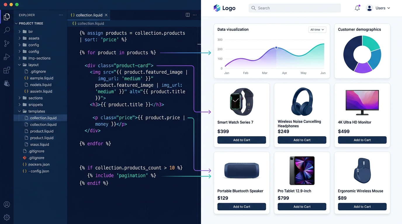
1. The Manual Route: Custom Liquid Shopify Video
Building a custom liquid block requires editing your theme files directly. You need to write specific CSS media queries to hide and show different video sources based on the user's screen size.
The Pros:
- Completely free to implement.
- No recurring monthly app fees.
- Keeps your total app count low.
The Cons:
- Hard to maintain during theme updates.
- Requires advanced frontend development skills.
- Lacks built-in shoppable tagging.
- High risk of breaking your mobile layout.
2. The App Route: Shoppable Feed Applications
Dedicated tools like ReelPik solve the mobile-first commerce problem instantly. This is the no-code route preferred by intermediate merchants looking to scale quickly.
The Pros:
- Instant integration: Add swipe-up feeds without touching code.
- Conversion features: Place Add-to-Cart buttons directly over the playing video.
- Automatic optimization: Apps handle the compression and format delivery for you.
Dedicated apps save hours of development time and protect your site speed by using external hosting networks.
III. 6 Strategies to Optimize Shopify Vertical Video
Adding videos is easy. Making them load fast and convert well takes strategy. Here are six ways to optimize your store's media for a flawless mobile experience.
1. Create a Shopify Separate Video Mobile Desktop View
Serving specific aspect ratios based on the user's device type is crucial.
Using the exact same video file for desktop and mobile is a major mistake. You need to serve different assets based on the user viewport.
Why this matters: A vertical file takes up too much screen real estate on a laptop. It forces users to scroll aggressively just to read your product details.
Here is how to fix this:
- Use CSS Display Rules: Set up classes like
hide-on-mobileandhide-on-desktopto control visibility across devices. - Upload separate formats: Prepare a 16:9 horizontal version for your desktop banners and a 9:16 version for mobile feeds.
- Leverage App Logic: Use the best vertical video app shopify offers to automatically detect the device and serve the correct aspect ratio without writing code.
2. Optimize File Sizes and Formats (MP4 vs WebM)
Raw video files exported directly from editing software are too heavy for e-commerce.
Why this matters: Huge file sizes drain mobile data and cause your store pages to buffer. This leads to immediate customer bounces.
Here is how to optimize:
- Choose the right format: Use WebM for the best compression quality on modern browsers. Keep MP4 as a fallback for older devices.
- Control the bitrate: Lower the video bitrate to ensure the file stays under 10MB. Aim for under 5MB for short mobile snippets.
- Strip audio if unnecessary: If your video is purely visual and plays automatically on mute, remove the audio track entirely to save space.
3. Implement Lazy Loading and Poster Images
This is the secret to passing Google Core Web Vitals while heavily featuring video on your product pages.
Why this matters: If your video tries to load before the main text of your product page, your LCP score will plummet.
Here is how to load smartly:
- Add a poster attribute: Always include a lightweight, compressed JPEG placeholder image that displays while the video buffers.
- Defer off-screen media: Use the
loading="lazy"attribute for any video that does not appear immediately at the top of the screen. - Preload hero videos safely: If the video sits at the very top, use
preload="metadata"rather than loading the whole heavy file instantly.
Pro Tip: Capture the most exciting frame of your video to use as the poster image. This acts like a YouTube thumbnail to entice the shopper.
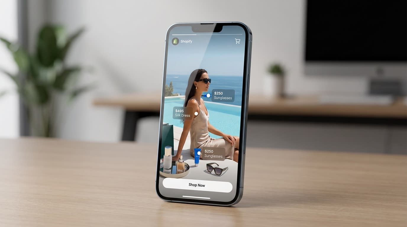
4. Build a TikTok-Style Swipe-Up Feed
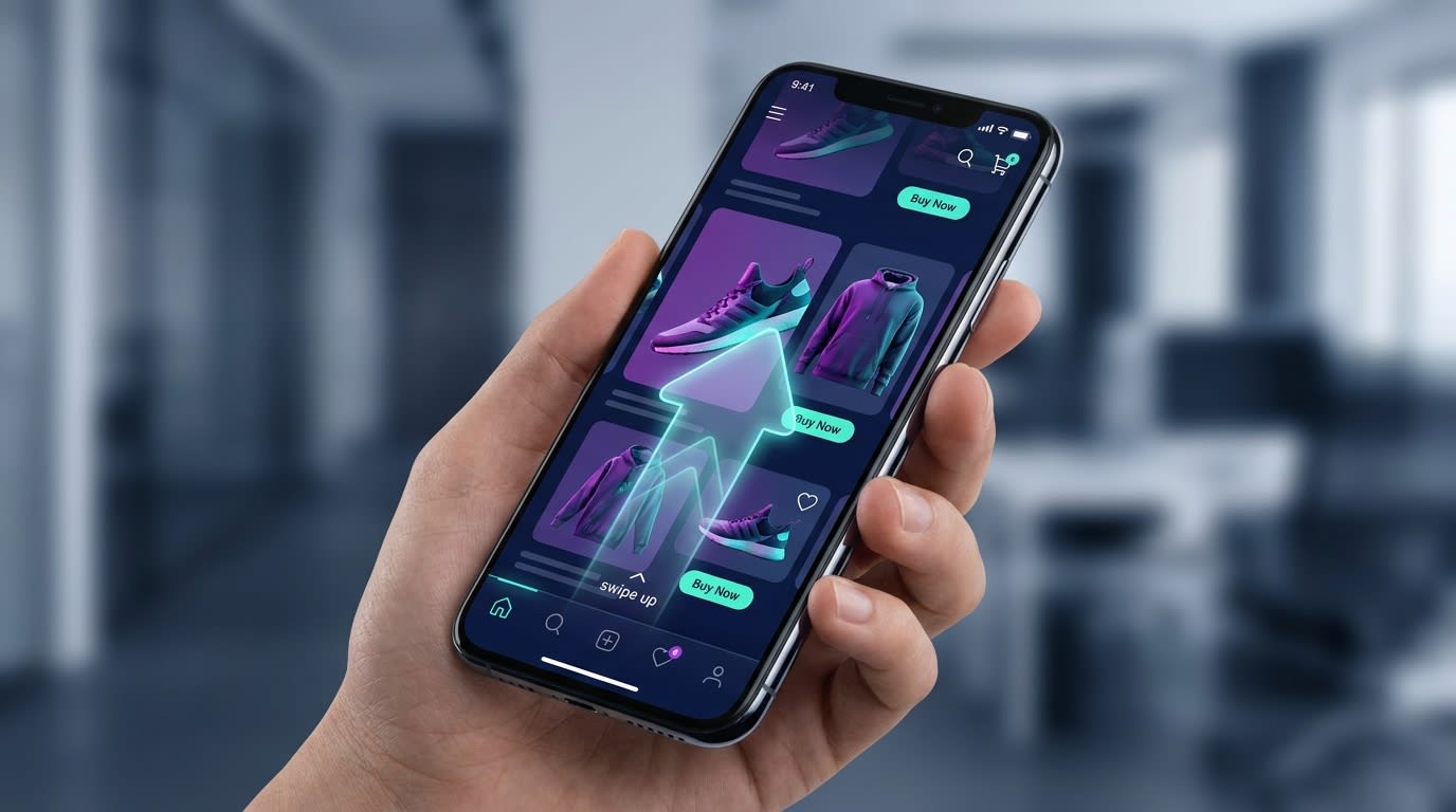
Interactive swipe-up feeds keep shoppers engaged much longer than traditional image galleries.
Static product pages are becoming outdated. Modern buyers expect an interactive discovery phase right on your website.
Why this matters: Data shows that swipe-up shoppable feeds transform customer experiences. They significantly increase the average time spent on your site.
Here is how to build it:
- Curate UGC content: Find videos created by actual customers using your product. For tips on gathering this content, read The Complete Guide to User-Generated Content for eCommerce.
- Group by collection: Create specific feeds for different product categories rather than mixing everything randomly.
- Use a dedicated app: Implement a trusted shoppable feed application to generate this swipe functionality effortlessly.
5. Add Direct In-Video Checkout Elements
A great video is useless if the customer has to hunt for the buy button afterward.
Why this matters: Reducing friction between inspiration and purchase is the core principle of conversion rate optimization.
Here is how to reduce friction:
- Overlay product cards: Ensure the product name and price float neatly over the bottom of the video player.
- Enable quick-add: Allow users to select their variant (size or color) and add to cart without leaving the video entirely.
- Keep crucial text visible: Ensure the
object-fit: coverCSS property does not cut off important text overlays on smaller mobile screens.
6. Track and Analyze Video Engagement
You cannot improve what you do not measure.
Why this matters: Knowing which videos drive sales helps you inform your future content creation strategy and ad spend.
Here is what to track:
- Monitor watch time: Look at the drop-off rate. If everyone leaves after three seconds, your initial visual hook is too weak.
- Track click-through rates: Measure how many users who watch the video actually click the integrated product tags.
- A/B test placements: Test whether your video performs better on the homepage, product page, or as a dedicated landing page feed.
IV. Other Things to Keep in Mind: The LCP-First Strategy
When optimizing for mobile commerce, you must adopt an "LCP-First" mindset. Visuals matter, but speed rules all.
1. Speed Over Resolution
Mobile users are watching on 6-inch screens, not 4K televisions. You do not need 1080p resolution for an effective product video. Downscaling your video to 720p drastically reduces the strain on your server while remaining perfectly clear to the mobile shopper.
2. Prioritize Above-the-Fold Content
If you feature a vertical video at the very top of your mobile site, ensure the surrounding text and header load instantly. Google penalizes sites where the hero video delays the entire page from becoming interactive. Always load your text first.
3. Rely on Reliable Hosting
Never host large raw video files directly within your Shopify files section if you can avoid it. Using a dedicated app ensures that your videos are delivered through an optimized Content Delivery Network (CDN). These networks utilize adaptive bitrate streaming to adjust quality dynamically based on the user's internet connection.
V. Conclusion
Mastering vertical video is no longer optional if you want to compete in today's mobile-first ecosystem. By serving the right aspect ratio, compressing your files, and focusing on load speeds, you provide an immersive shopping experience that feels natural to your buyers.
You do not have to struggle with custom liquid coding or broken mobile displays. Taking advantage of dedicated shoppable feed tools allows you to focus on sourcing great content while the technology handles the heavy lifting. You've got this!
Follow the Fordeer Team for more useful updates!
- Install Fordeer Apps for Free
- Get immediate assistance by chatting with us
- Join Fordeer Commerce Community for fresh app updates, expert tips, and private deals.